We provide Free Customer Support for all Curly Themes products through our quick and easy ticket application interface. Please limit your inquiries to problems related to the theme, its setup and features. For any problems concerning third-party plugins you should address the application’s developer.
Note: We can not offer support for custom CSS code customization. You should ask a professional developer for aid if you require help with advanced customization and programming.
Curly Themes offers a free ticket support application for all clients, through a real-time purchase code automatic verification. The dedicated app is fast and easy to use and includes an email notification feature. We will let you know as soon as your inquiry has received an answer. Thanks to our modern design, you can also upload images as an attachment to your support ticket.
Before writing a ticket please get your License Certificate:
curlythemes.com/support/docs/leisure-wp-theme
purchase code
Before opening a new ticket, please make sure you have read through all our documentation. Also, our Knowledge Base contains helpful answers to questions we often receive from our customers. Following these steps is in the users’ interest, as they will save valuable time. Still, we are always happy to respond to any inquiries you may have related to our theme.
Before installing this theme you need to have a WordPress platform already installed on your server. You can download it from WordPress.org if you don’t have it already.
If you do not know how or you have problems with the installation, you can access helpful information at:
Step 1— The .zip file you downloaded from Theme Forest contains a folder named leisure
Step 2 — Upload this folder on your server in your WordPress directory to /wp-content/themes/
Note: We recommend that you use FileZilla FTP client.
How to set up your homepage content
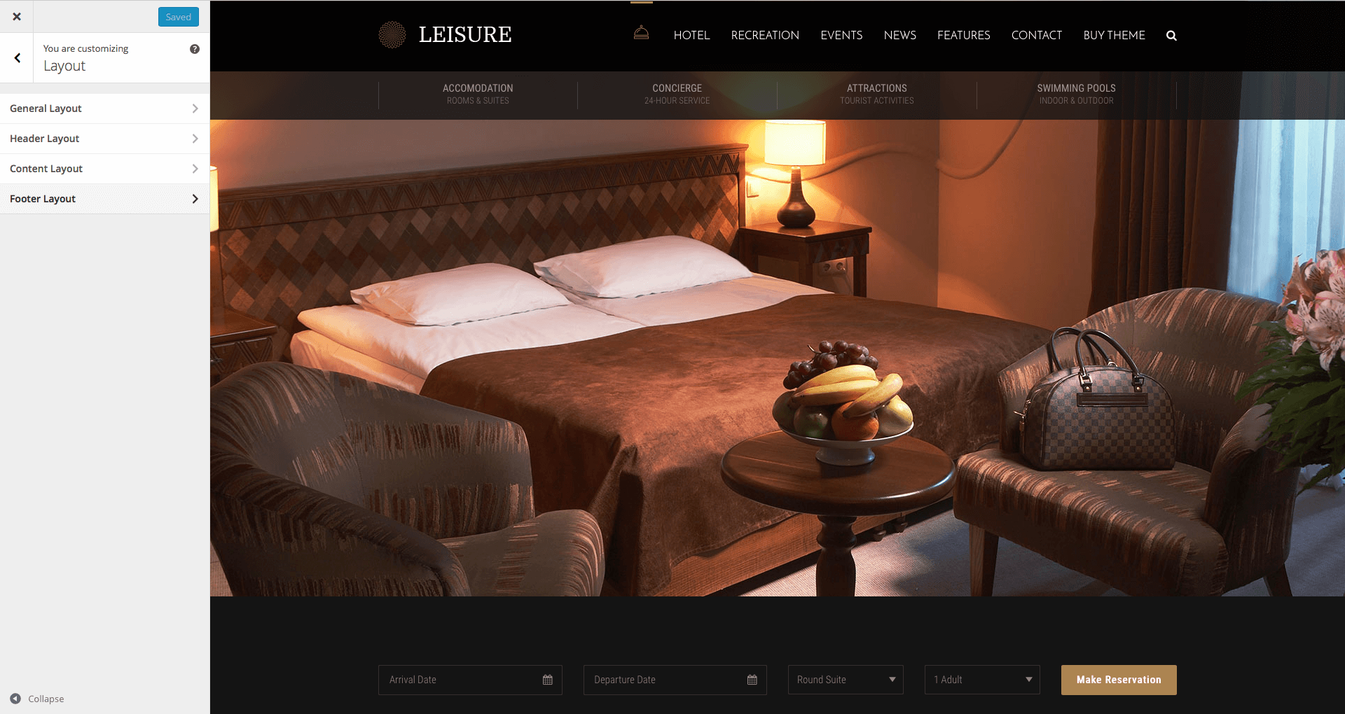
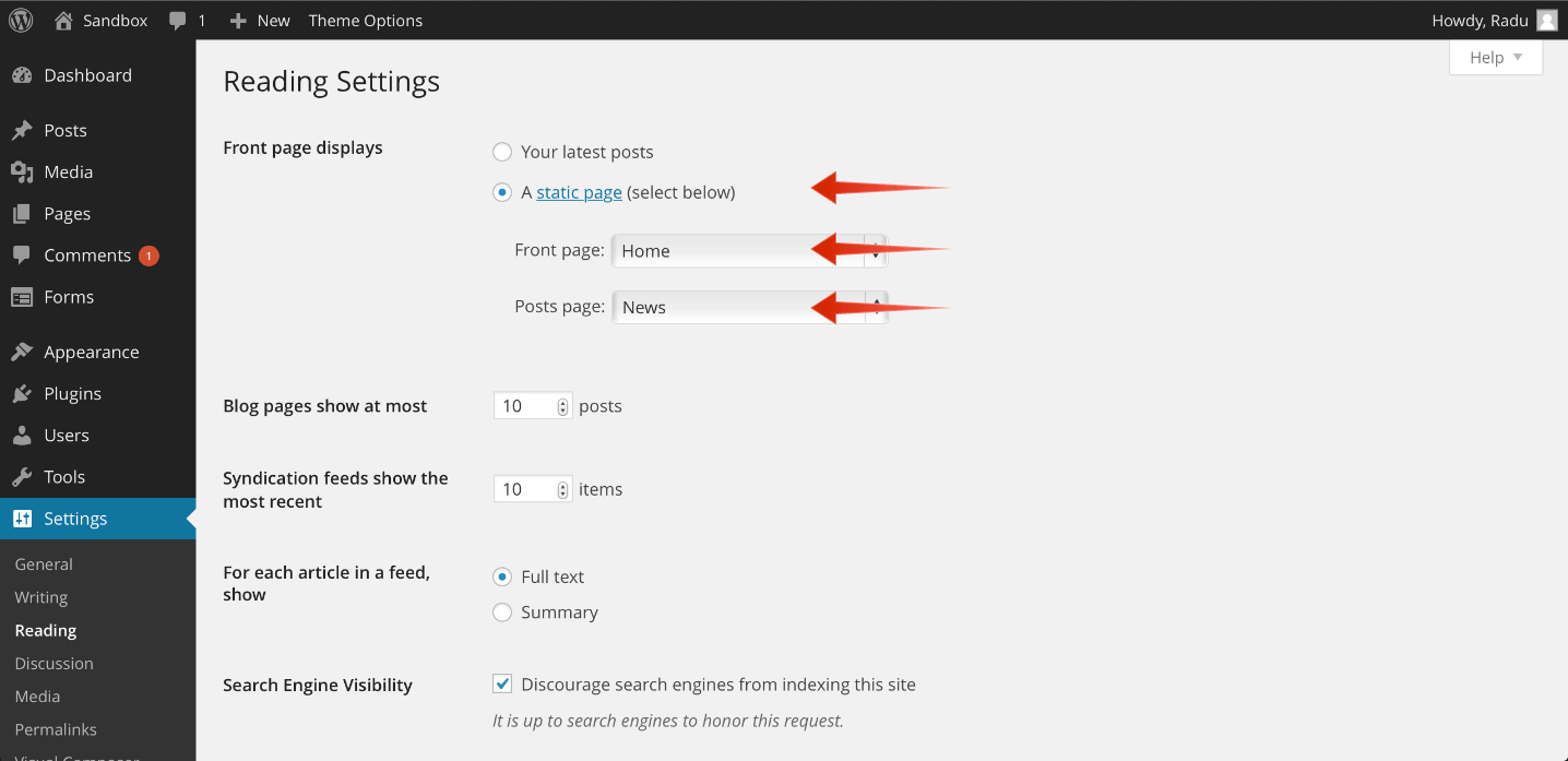
After successfully importing the demo content, the demo slider and the demo forms, you need to follow a few simple steps and begin replacing the demo content with your own. Our demo is using the default settings for layout. You can go at Appearance > Customize > Layout and verify if you have the default settings. At GeneralLayout you should have Full-width and Wide and Large Padding. At HeaderLayout you should have Stretched and Wide and Large Padding. At ContentLayout you should have Same as General Layout Style and Wide and Large Padding. At FooterLayout you should have Stretched and Wide and Large Padding.Step 1: Go to Settings > Reading > Front Page Displays and choose A Static Page. Use the Front Page select box to choose Home and the Posts Page select box to choose News.
Step 2: Go to Slider Revolution, click on the Pencil button, under the imported slider, and click on the images to change them with your own. You can click on the Add Slide button to add more images in the slider.
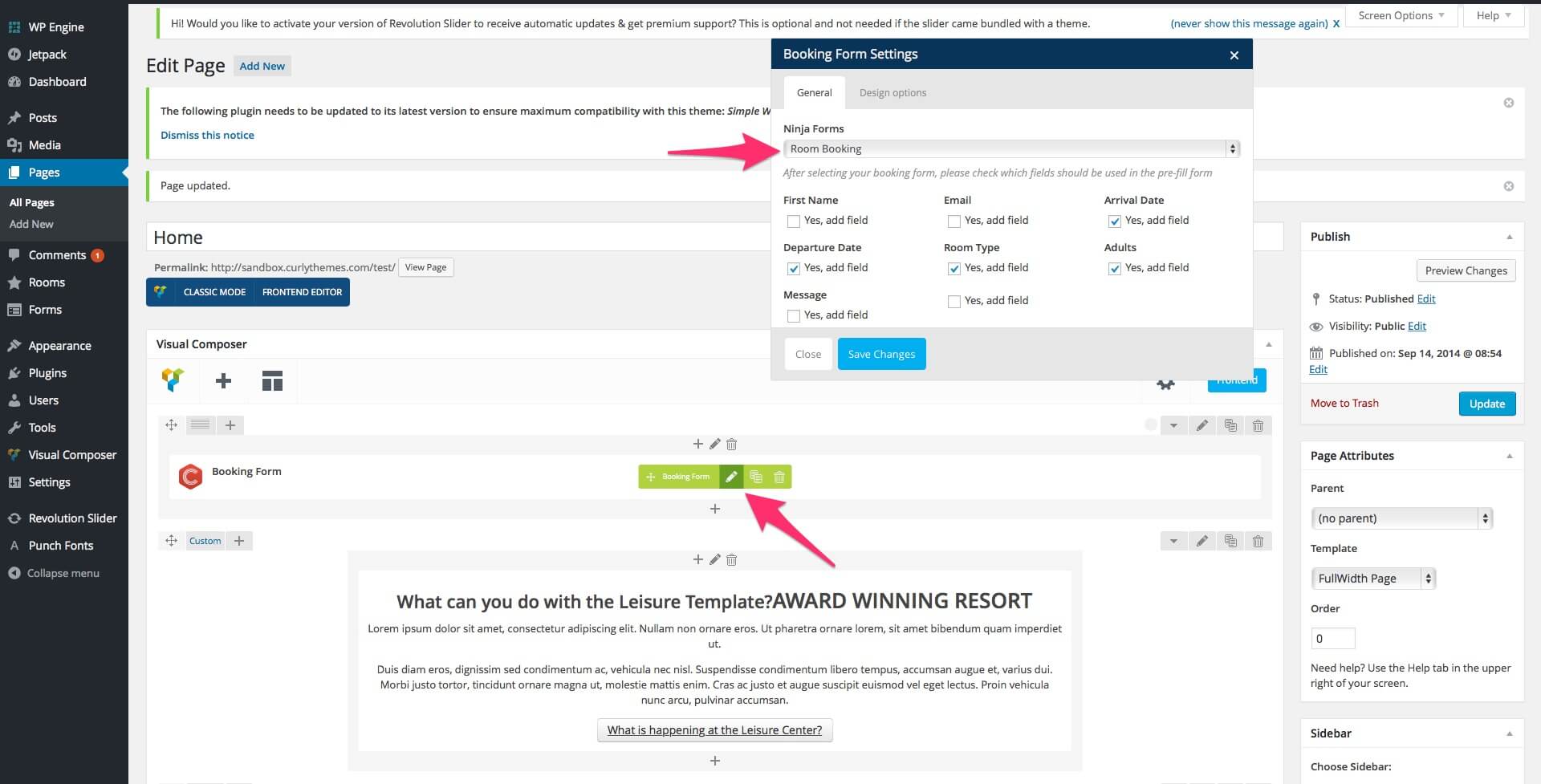
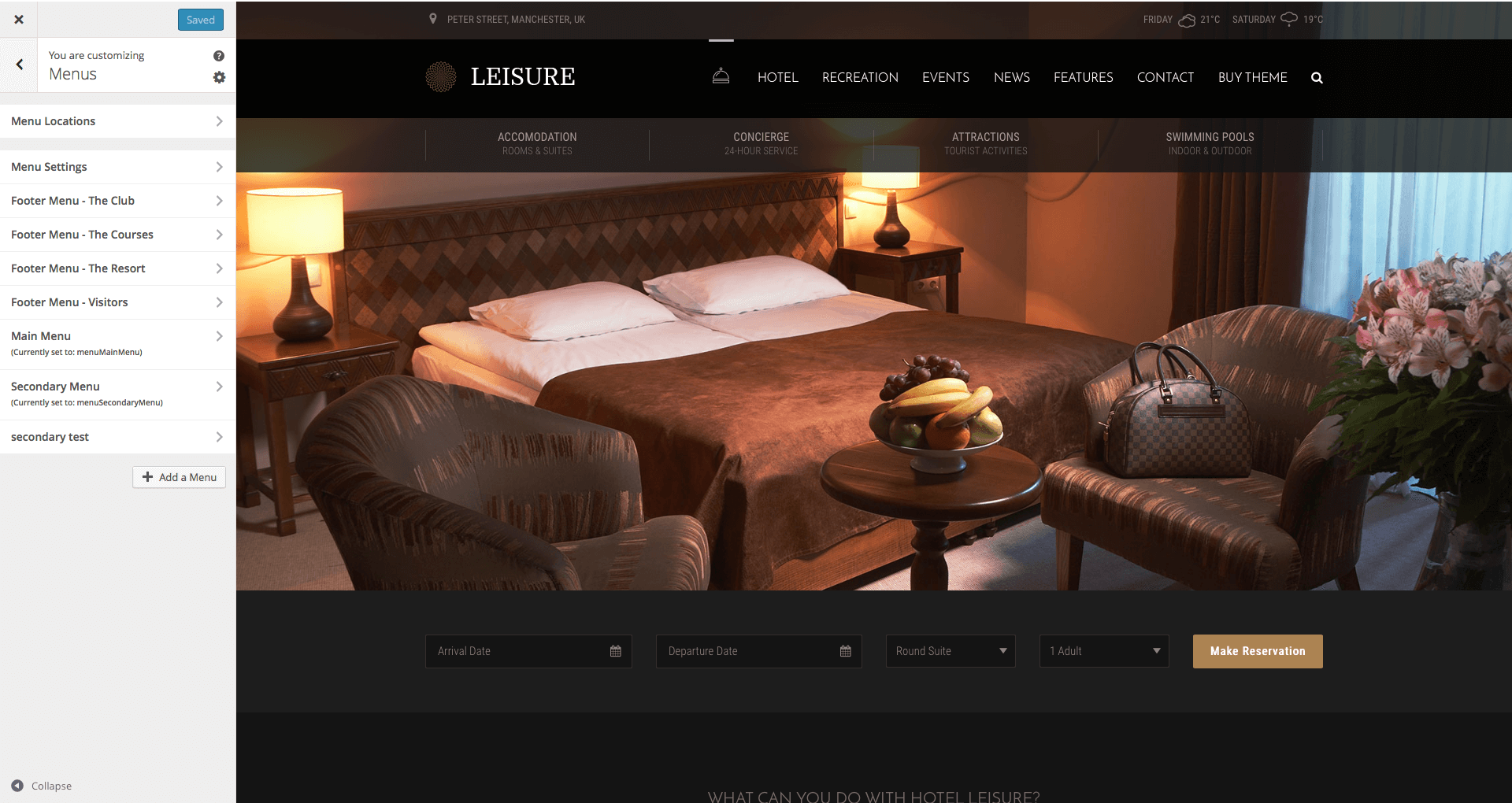
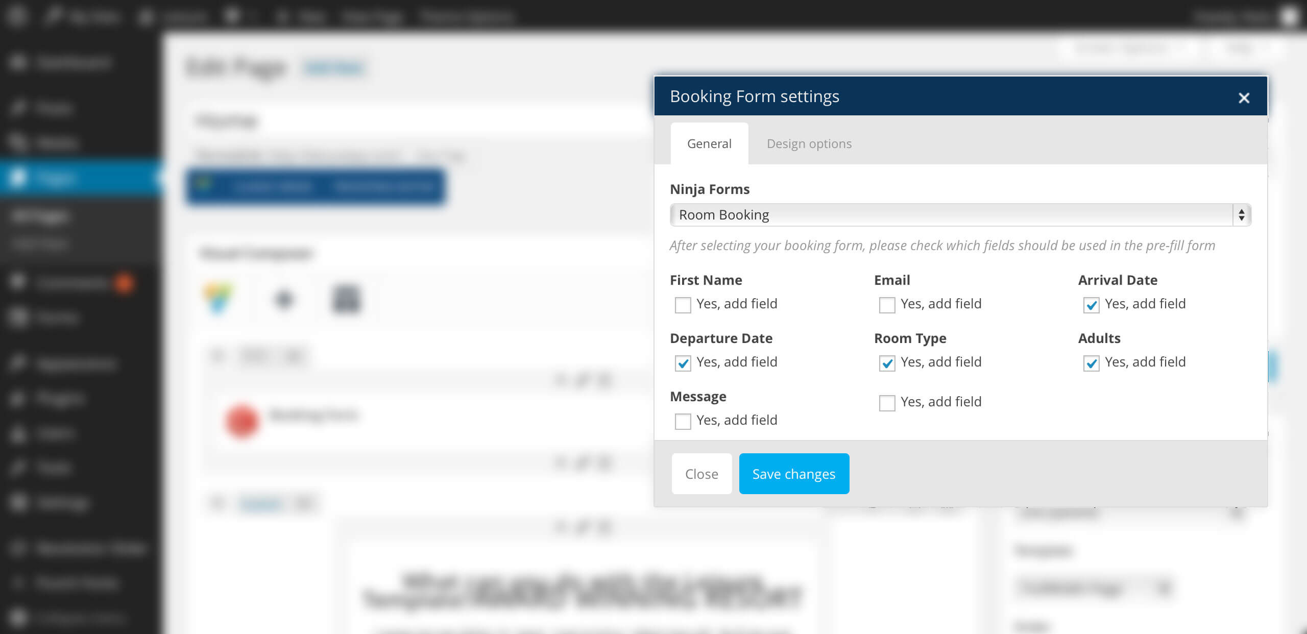
Step 3: Go to Appearance > Customize > Menus > Menu Locations and use the Main Menu select box to choose Menu. If you want to use two menus, use the SecondaryMenu select box to choose Services. You can define the structure at Appearance > Menus. The first level elements of the Secondary Menu allow a Background Image and a Description. If you can’t see the Description field, click on Screen Options, at the top right corner of the screen, to reveal the top panel and check the Description box to add it in the options. The background image will be displayed only if the Secondary Menu element has sub-elements.Step 4: Go to Pages and edit the Front Page. Go to the Visual Composer booking form element and click on Edit Booking Form. Use the Ninja Forms select box to choose Room Booking and then check the boxes for the fields you want to add.
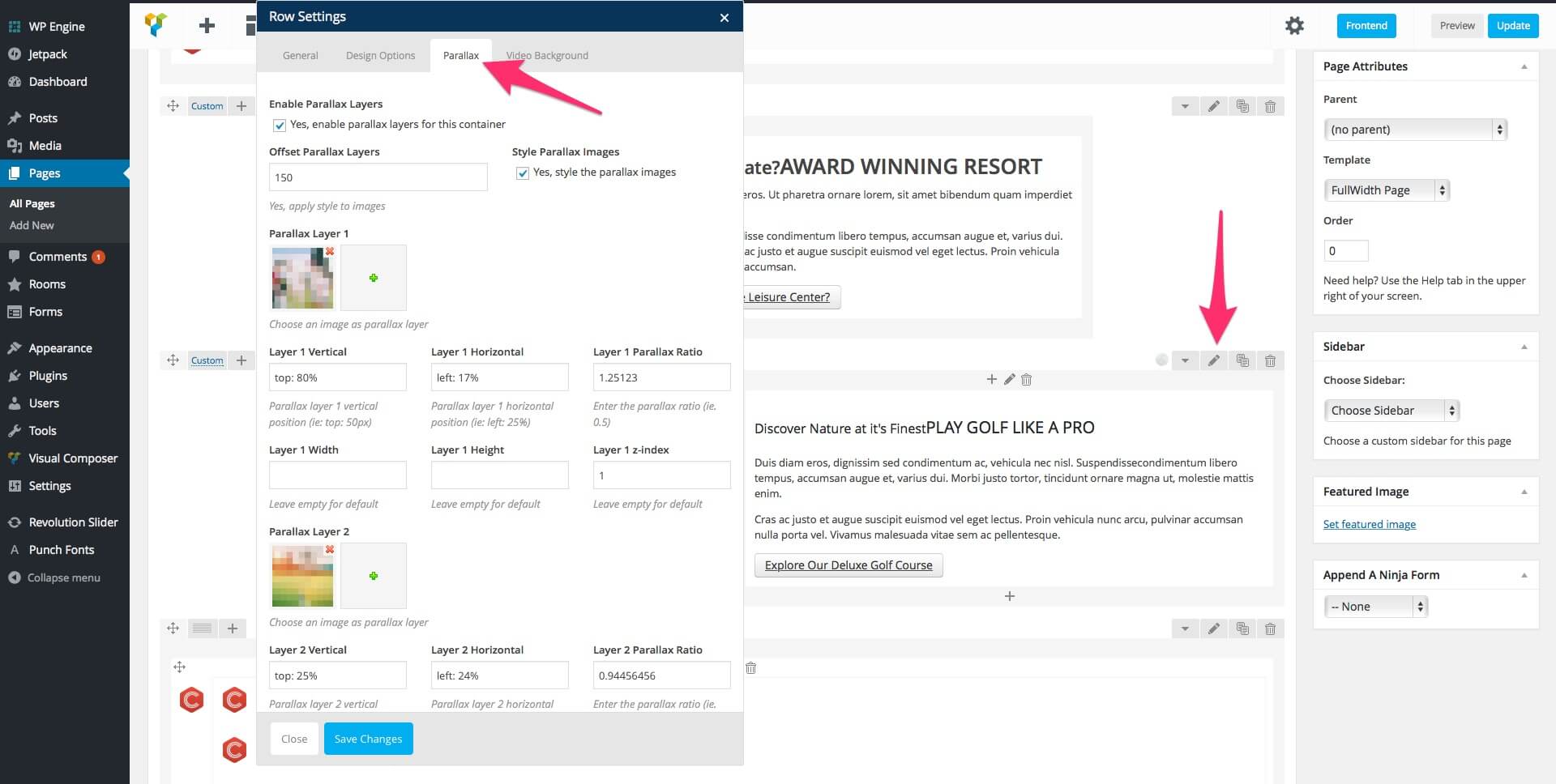
Step 5: Edit the Home Page and go to the Visual Composer element with parallax images. Click the Edit this Row button and select the Parallax tab. Here you can replace the parallax images with your own and also customize the parallax settings. The background image can be changed in the Design Options tab.
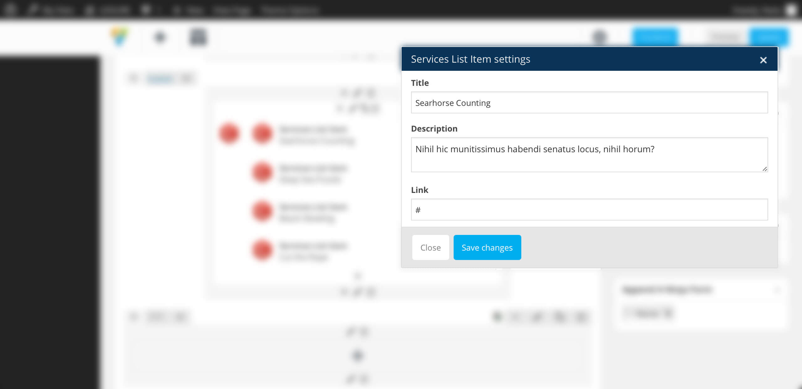
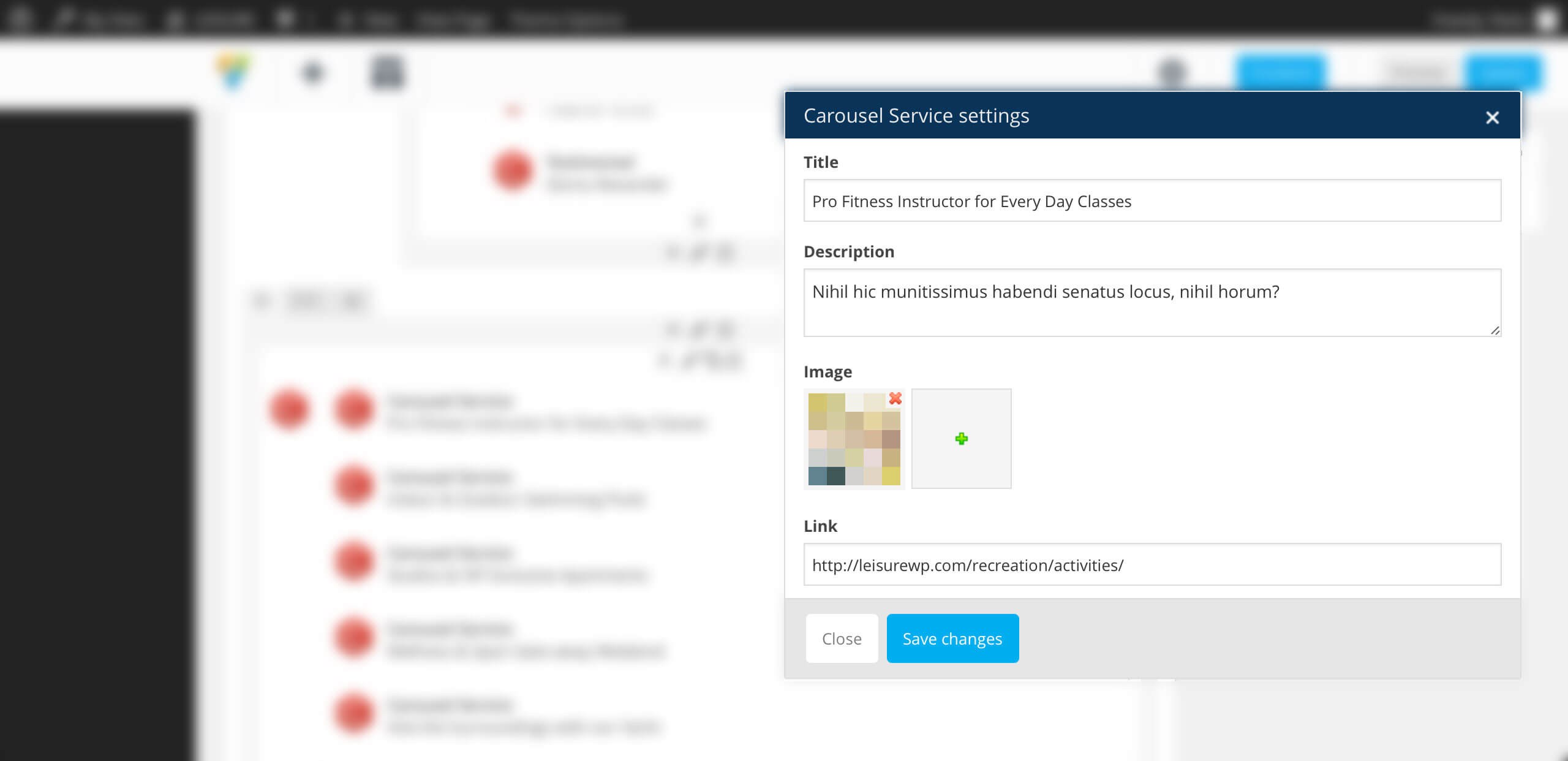
For the element below, you can edit the images in the Visual Composer carousel by clicking the Edit Carousel Service button for each carousel element.
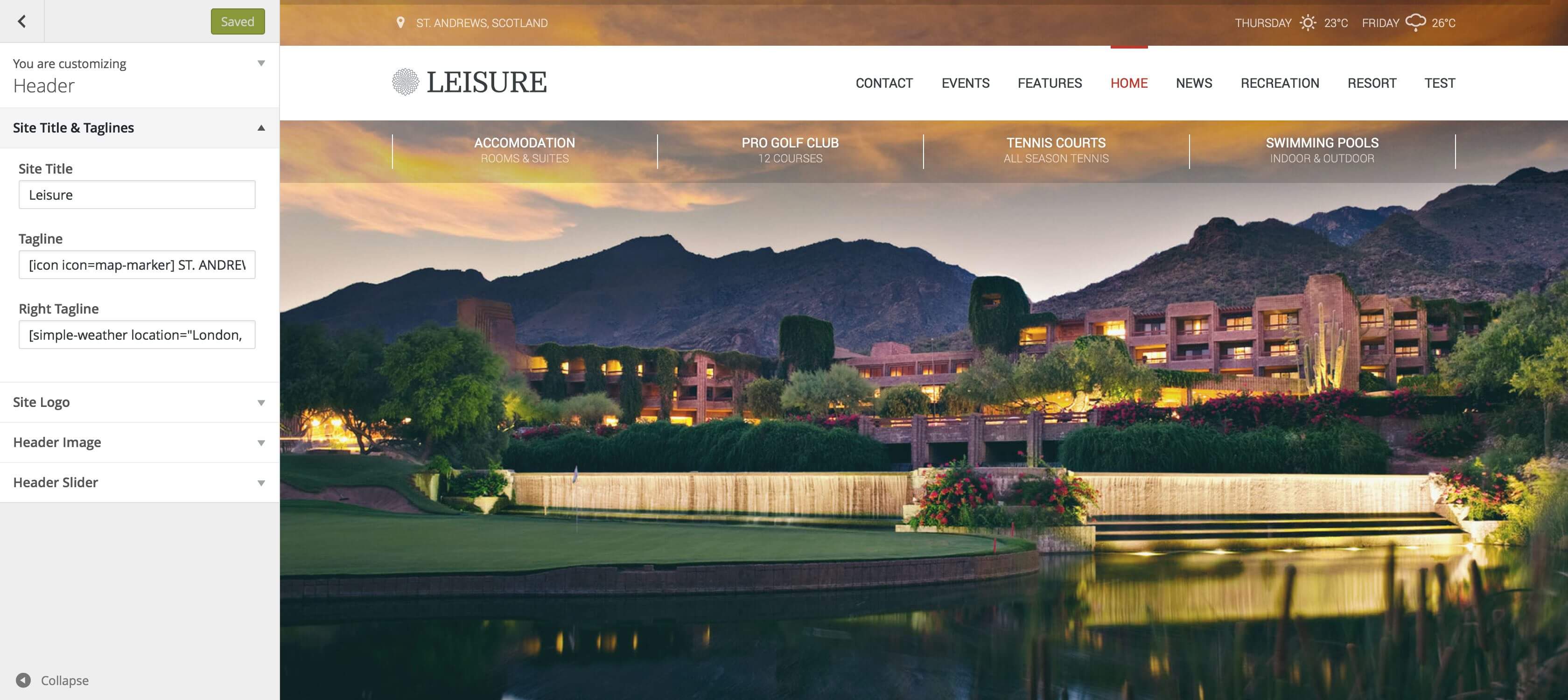
Step 6: If you want to display the weather in the top right corner, go to Appearance > Customize > Header > SiteTitle& Taglines. In the Right Tagline field add the weather shortcode, like this:
simple-weather days="2" location="Bucharest, Ro" units="metric"
To learn more about how you can customize the weather display, you can read the Simple Weather chapter.
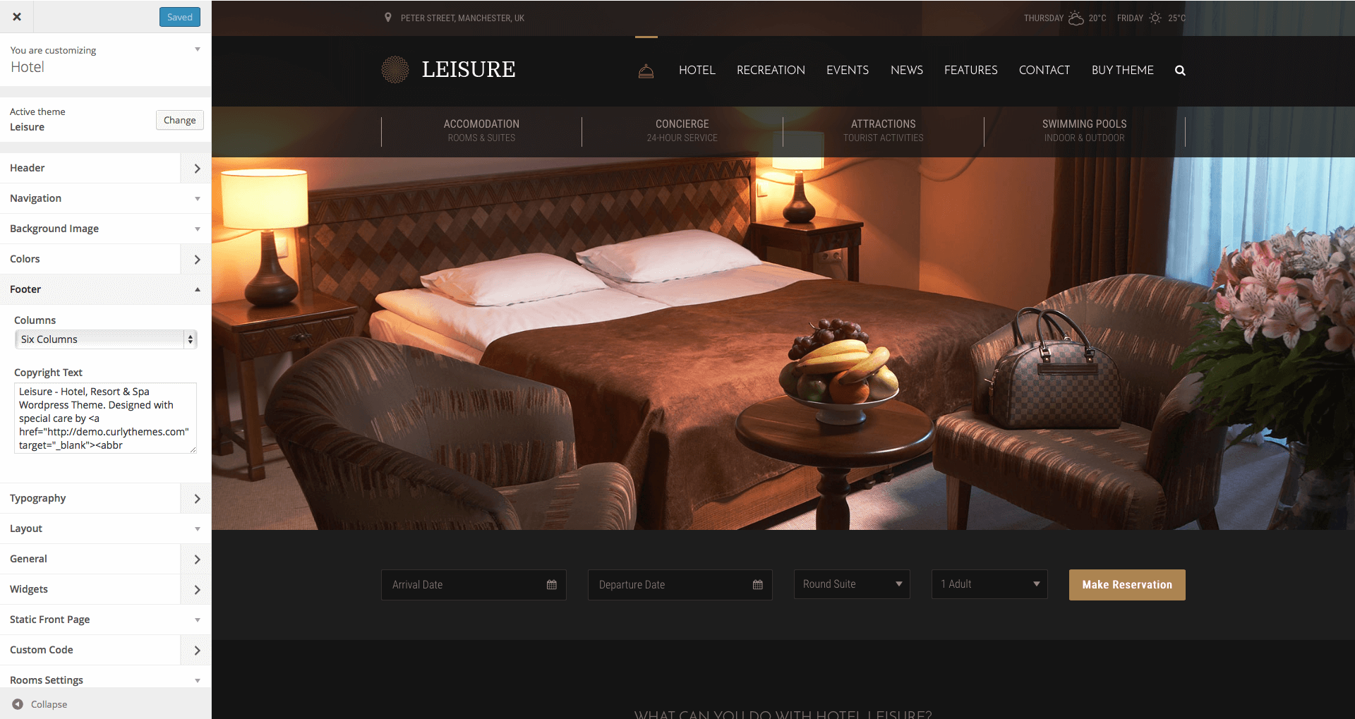
Step 7: Go to Appearance > Widgets > FooterWidgetArea and add the elements you want in your footer. Next, go to Appearance > Customize > Footer > CopyrightText and edit the HTML code to insert your own social media links.
In the following code, replace # with your social media links and edit the titles.
Important: Before updating it is important to know that theme settings and content are not lost during the update process. You will lose changes to the theme files, if you changed any files. In order to prevent losing the file changes, we strongly recommend that you use child themes. Also, we recommend that you look in the release notes before updating.
The theme update can be done via FTP or via WordPress. Theme update can be done automatically or manually, depending on the method you prefer. Both methods are presented below as follows:
Auto-Update can be done directly in your WordPress Dashboard, with Envato Market plugin, which will help you easy manage all your Envato products. You can find this plugin here: Envato Market Plugin
Manual Update can be done via FTP or via WordPress. No matter what method you choose, you first need to download the new theme files from Theme Forest. To download the new files, you need to follow these steps:
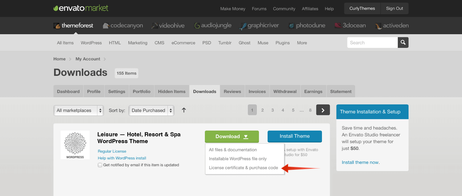
Login to your Theme Forest account, go to Downloads and search for Leisure - Hotel, Resort & Spa WordPress Theme in your downloads list.
Click on the download button and choose the files you wish to download. You can either download the Installable WordPress Theme (this consists only of the theme files needed for update) or the Main Files package.
Now, based on your choice of install options, follow the method you prefer most:
Login to your FTP account and go to Wp-content > Themes. Delete the old folder called leisure.
Unzip the new update previously downloaded. If you downloaded the Installable WordPress Theme, you will need only to unzip this file. If you downloaded the Main Files, you first need to unzip the Main Files, then you need to unzip leisure.zip
Upload the leisure unzipped folder to your Wp-content > Themes folder.
Login to your WordPress dashboard and head over to Appearance > Themes and deactivate Leisure
Delete the old Leisure theme.
Upload the new theme file. You can either upload the Installable WordPress Theme or unzip the Main Files package and upload the leisure.zip file.
After uploading, activate Leisure and you are done!
Importing the Demo Content
In the Leisure download package you can find the Demo XML file (located in the demo content folder) that you can use for a quick theme set up. Images, videos and sliders are not included in the XML file.
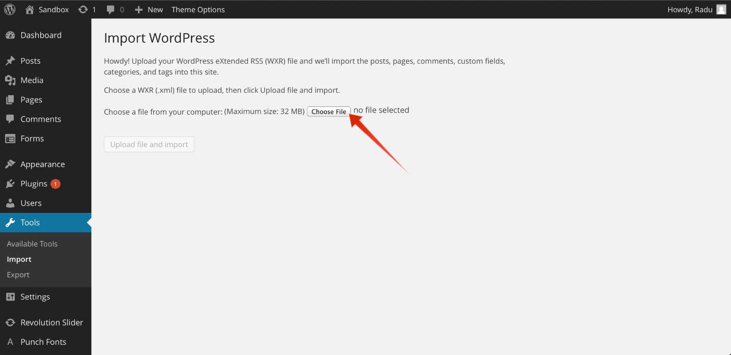
To import the demo XML file, in the WordPress dashboard go to Tools > Import and select to install from the list WordPress Importer. After the installation is complete, select and upload the XML file. You can find the demo XML file in the demo content folder at root level in the Leisure download package. In the demo content folder you will find three folders: ninja forms, revolution slider and wordpress xml data, each of them with it’s relevant demo content. The process can take up to a few minutes.
Inside the wordpress xml data folder, you will find the demo.xml file, which contains the white demo. Also, you will find the black folder, which contains the demo-black.xml file, with the black hotel demo.
After the import process, go to Appearance > Menus and from the Manage Locations tab, use the Main Menu select box to choose the Main Menu option. Click the Save Changes button to record the changes.
After this go to Settings > Reading and from the A static page radio button, use the Front page select box to choose your home and the Posts page select box to choose the page for your blog.
Note: If you have a problem loading the XML file, it might be caused by host limitations. You need to uncheck the Download images and attachments box to upload only your pages and posts.
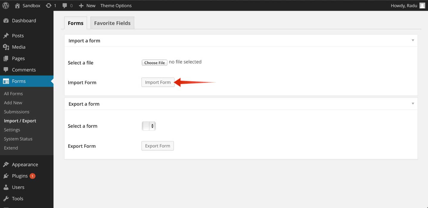
To import a form used in the demo, you need to go to your Dashboard and then to Forms > Import / Export and select one of the demo forms located in the demo content folder, in the ninja forms folder, which contains all the forms used in the demo.
curlythemes.com/support/docs/leisure-wp-theme
Import Demo Ninja Forms (Booking Forms)
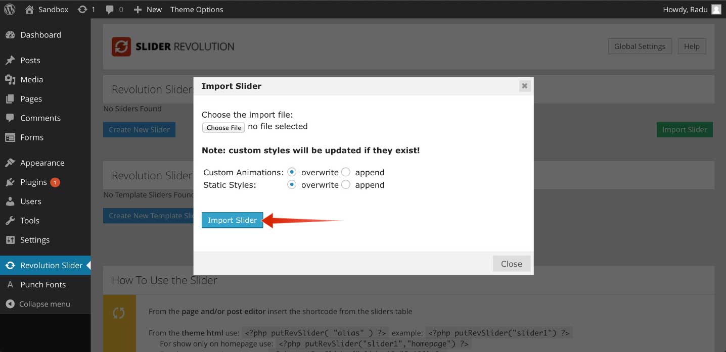
To import the slider used in the demo, you need to go to your Dashboard and then to Revolution Slider, click on Import Slider on the right side of the screen and select the demo slider located in the demo content folder, in the revolution slider folder, which contains the slider used in the demo. If you want the slider used in the black demo, you should import the home-black ZIP file.
If you want to migrate your website from another WordPress theme to the Leisure theme, you need to resize the thumbnails using the Regenerate Thumbnails plugin. Go to Regenerate Thumbnails Plugin to download the plugin and follow all the required steps. Also, do not forget to adapt the shortcodes.
Theme Requirements
The theme needs to be hosted on a server that is running WordPress 4.0 or higher, PHP5 or higher, and MySql 5 or higher. Our WordPress Theme has been successfully tested with Mac, Windows and Linux. Also, to ensure that your experience is 100% safe, please follow the below checklist:
Make sure that your server is allowing WordPress to operate normally; some servers restrict WordPress functions, causing potential problems.
Please be sure to operate the latest version of WordPress available. To download the latest version of WordPress, you need to go to the official WordPress.org website.
Please make sure that you are using the latest version of the theme. To download the latest version of theme, you need to go to your Theme Forest account, under the Downloads tab.
WordPress Theme Upload
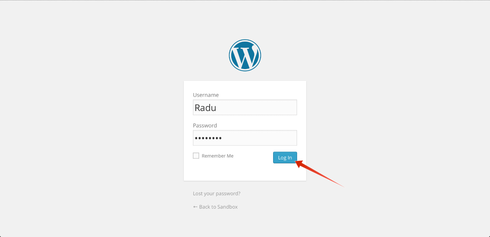
Step 1 — Login to WordPress Dashboard
curlythemes.com/support/docs/leisure-wp-theme
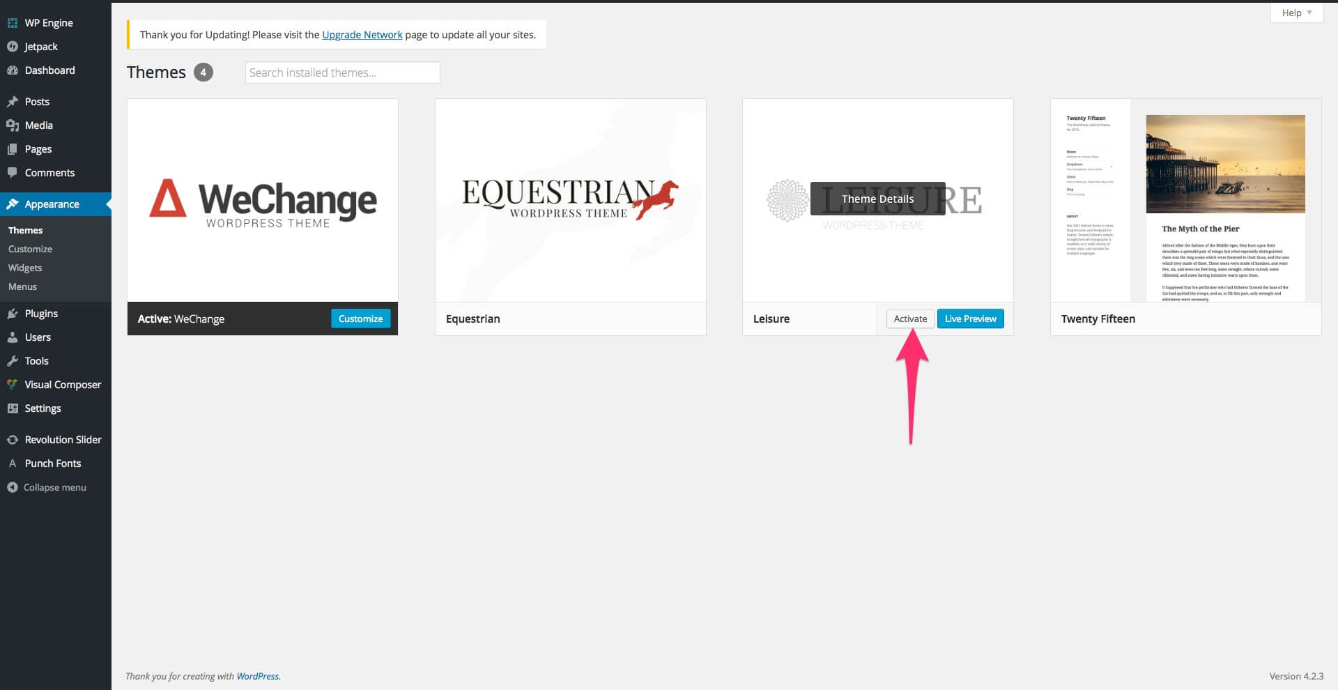
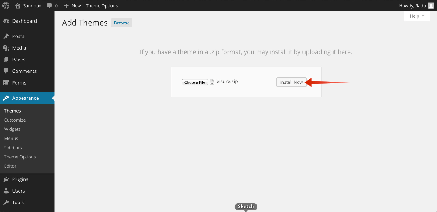
Step 2 — Go to Appearance > Themes > Add New
Step 3 — Click Upload and select the file leisure.zip from your computer, after this click the Install Now button.
Step 4 — Wait for the theme to be installed. Once installed, you will be notified.
Warning: Please make sure that you upload the leisure.zip file and NOT the pack.zip file!
Quick Theme Setup
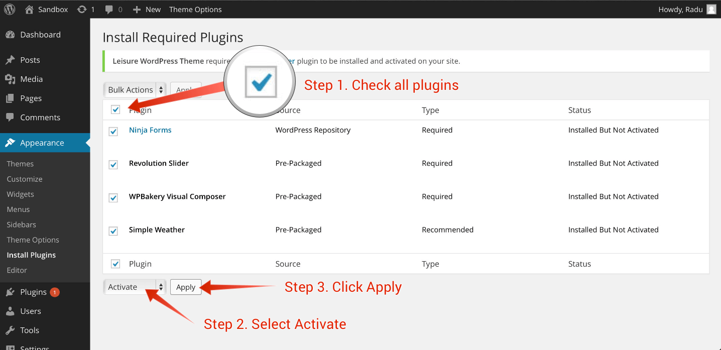
After installing the theme, the recommended plugins and the demo content, it is best that you configure your theme to your desire. Please follow the next steps for a quick setup:
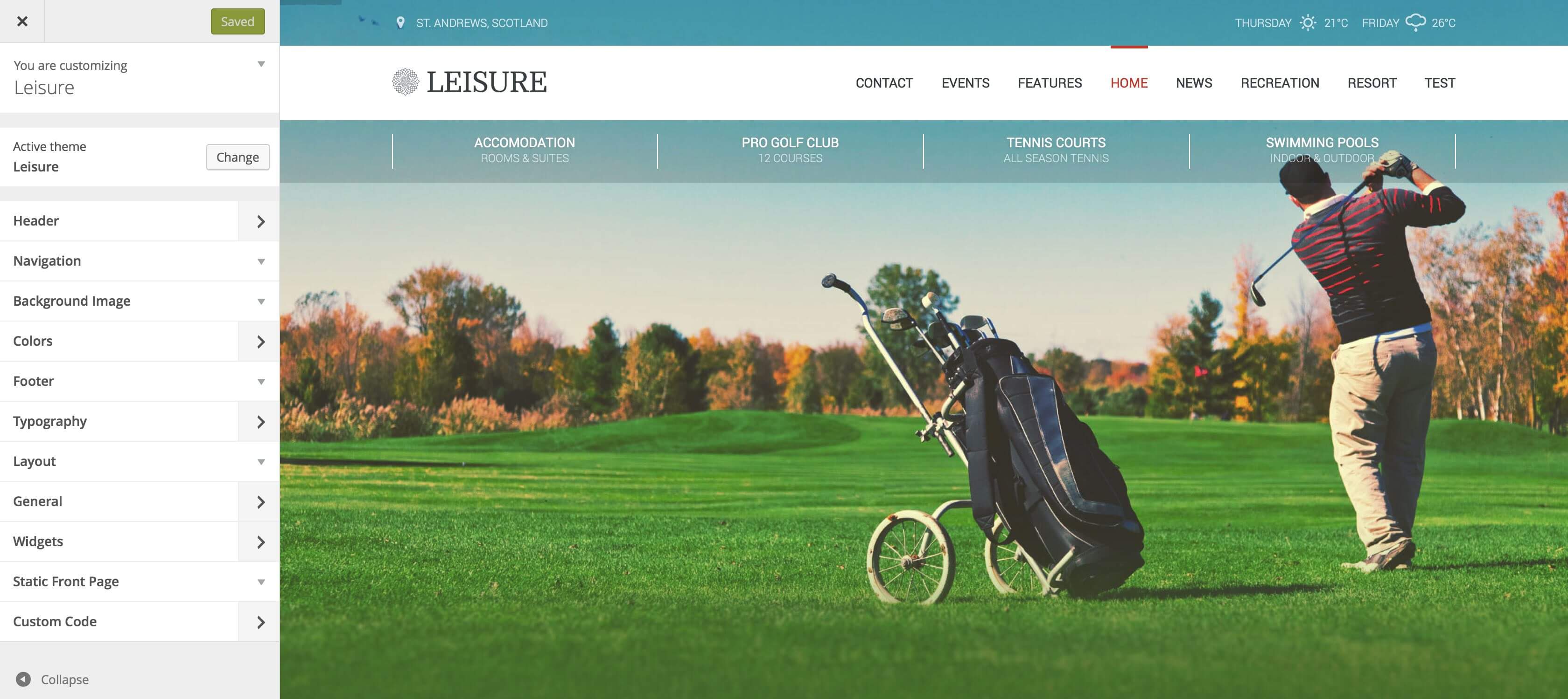
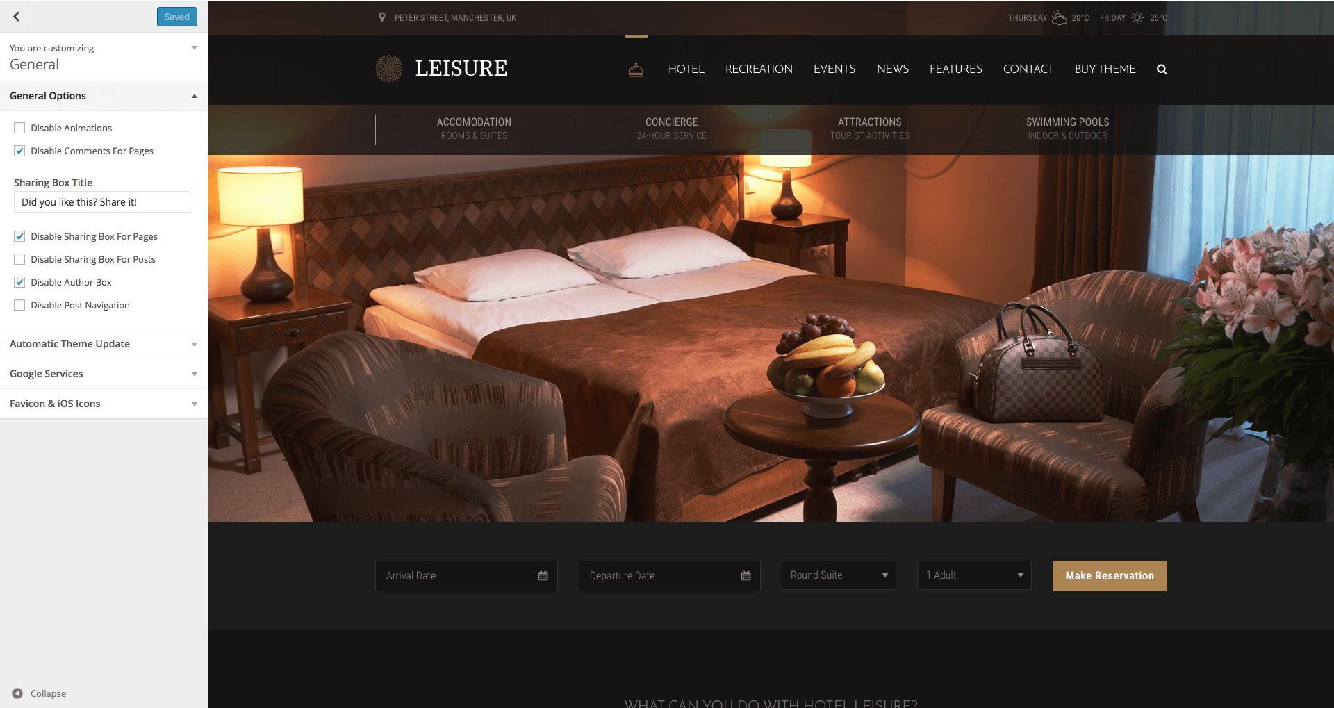
From your Dashboard, head over to Appearance > Customize and start customizing the theme. Our smart options sidebar, on the left, lets you change anything and see the effects in action right away. The panel elements with a right pointing arrow have their own sub-panel. The elements with a downward arrow open their options in the same panel. Here is a short description of all sections and fields:
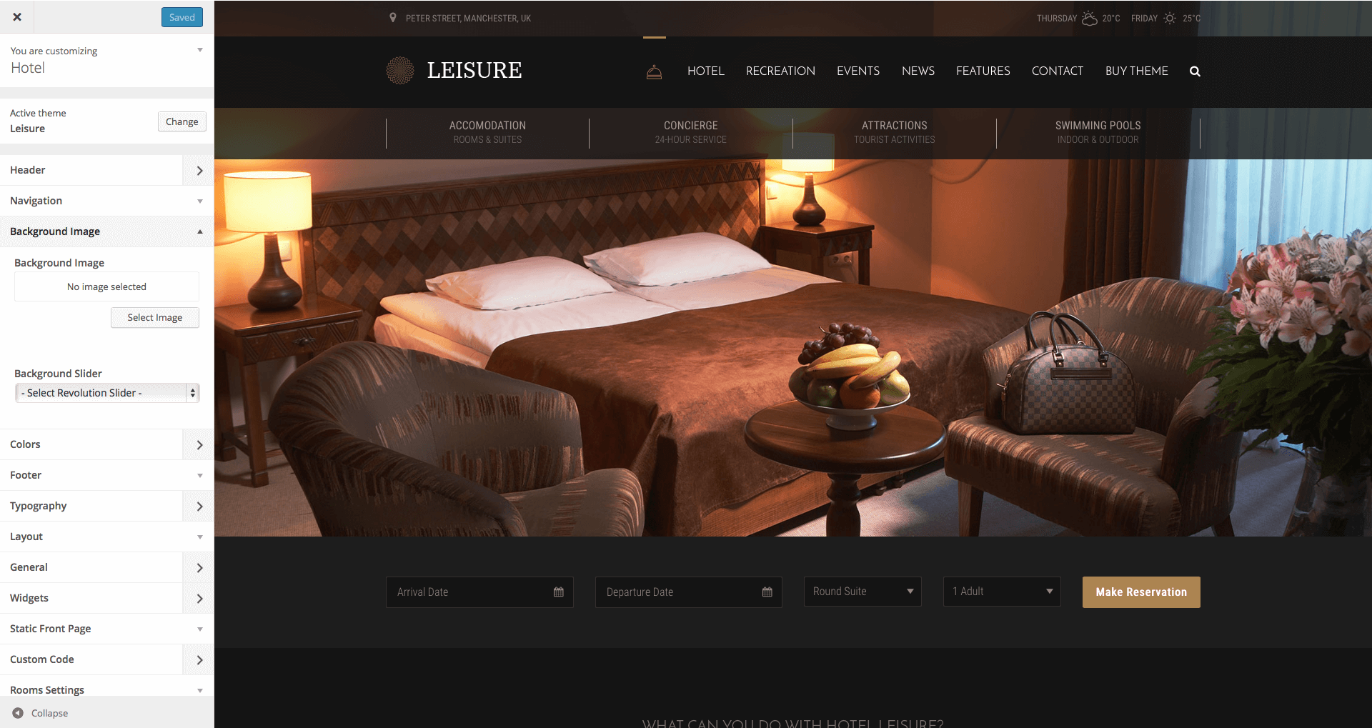
Background Image – Here you can upload a custom background image for your website. Default: none
Background Slider – Before being able to set a background slider, you first need to create / import one from the Revolution Slider menu. After creating or importing a slider, select the background slider from the list.
Custom CSS – If you want to use additional code, you can insert here your custom CSS code. This code will work globally, for all devices.
Small Devices CSS – If you want to use additional code for your website on small screen devices, you can insert here your custom CSS code. Small screen devices have a display with less than 768px.
Medium Devices CSS – If you want to use additional code for your website on medium screen devices, you can insert here your custom CSS code. Medium screen devices have a display with more than 768px and less than 992px.
Large Devices CSS – If you want to use additional code for your website on large screen devices, you can insert here your custom CSS code. Large screen devices have a display with more than 992px and less than 1200px.
Extra Large Devices CSS – If you want to use additional code for your website on extra large screen devices, you can insert here your custom CSS code. Extra large screen devices have a display with more than 1200px.
Logo Retina (@2x) – Upload your retina logo here. Your retina logo should be double size than your normal logo. This will ensure that your logo will look crystal sharp on retina devices. Default: none
Small Devices Logo – If you want to use a different logo for small devices, you can upload one here. A small device has less than 768px.
Small Devices Retina Logo (@2x) – Upload your retina logo for small devices here. Your small devices retina logo should be double size than your small devices logo.
Sticky Logo – If you want to use a different logo for the sticky menu, you can upload one here. This option is active only if you are using the sticky menu.
Sticky Retina Logo (@2x) – Upload your retina logo for the sticky menu here. Your sticky menu retina logo should be double size than your sticky menu logo.
Leisure uses header images. The minimum size for the header image is 1600 x 400 pixels. By default, the theme has no header image and uses the link color as background. This is a global setting and will affect all pages. Alternatively, you can have more images and display them randomly.Important: The global header images can be overridden by the Header Slider or by the Individual Page Settings.
Current header – Displays your current header image. You can Hide it or you can Add new image. If you choose to add more images, the header will choose, each time, a random one.
Previously uploaded – Displays the header images you uploaded.
Randomize uploaded headers – If you add more images, the header can choose, each time, a random one. Push this button to display a random image.
Before being able to set a header slider, you first need to create / import one from the Revolution Slider menu. After creating or importing a slider, select the header slider from the Header Slider field. By default, there is no header slider set.
Important: If you set-up a header slider, all header images will be overridden except the Individual Page Settings.
Layout Mode – Here you can choose the layout of your website. You have two available options: Full-width and Boxed. The default option is Full-width.
Layout Style – Here you can choose a predefined size and padding for your layout or go for a Custom Layout Style. The predefined options available are Wide and Large Padding, Narrow and Small Padding and Full-width and No Padding. The default option is Wide and Large Padding.
Custom Layout Size – If you selected a Custom Layout Style, you can use this slide bar to select a global size for your website. This size will affect all sections: header, content and footer. If you want to use different sizes, you should set different values for each section, using the other layout tabs.
Custom Layout Padding – If you selected a Custom Layout Style, you can use this slide bar to select a global paddings for your website. This padding will affect all sections: header, content and footer. If you want to use different paddings, you should set different values for each section, using the other layout tabs.
Header Mode – Here you can choose the layout of your header. You have five available options: Same as General Layout Mode will use the same option that you have selected in the General Layout Mode tab. Stretched will stretch the background of the header for the full length, outside the box. Boxed will make the header boxed. Full-width will stretch your header for the full length. Transparent will make your header transparent, with the Stretched header settings. The default option is Stretched.
Header Style – Here you can choose a predefined size and padding for your header or go for a Custom Header Style. The predefined options available are Same as General Layout Style, Wide and Large Padding, Narrow and Small Padding and Full-width and No Padding. The default option is Same as General Layout Style.
Custom Header Size – If you selected a Custom Header Style, you can use this slide bar to select a size for your header.
Custom Header Padding – If you selected a Custom Header Style, you can use this slide bar to select a padding for your header.
Content Mode – Here you can choose the layout of your content. You have three available options: Same as General Layout Mode will use the same option that you have selected in the General Layout Mode tab. Boxed will make the content boxed. Full-width will stretch your content for the full length. The default option is Same as General Layout Mode.
Content Style – Here you can choose a predefined size and padding for your content or go for a Custom Content Style. The predefined options available are Same as General Layout Style, Wide and Large Padding, Narrow and Small Padding and Full-width and No Padding. The default option is Same as General Layout Style.
Custom Content Size – If you selected a Custom Content Style, you can use this slide bar to select a size for your content.
Custom Content Padding – If you selected a Custom Content Style, you can use this slide bar to select a padding for your content.
Footer Mode – Here you can choose the layout of your footer. You have four available options: Same as General Layout Mode will use the same option that you have selected in the General Layout Mode tab. Stretched will stretch the background of the footer for the full length, outside the box. Boxed will make the footer boxed. Full-width will stretch your footer for the full length. The default option is Stretched.
Footer Style – Here you can choose a predefined size and padding for your footer or go for a Custom Footer Style. The predefined options available are Same as General Layout Style, Wide and Large Padding, Narrow and Small Padding and Full-width and No Padding. The default option is Same as General Layout Style.
Custom Footer Size – If you selected a Custom Footer Style, you can use this slide bar to select a size for your footer.
Custom Footer Padding – If you selected a Custom Footer Style, you can use this slide bar to select a padding for your footer.
Menu Panel
curlythemes.com/support/docs/leisure-wp-theme
Menu Panel
Main Menu – Choose your main menu. You can create one from Appearance > Menus or by using the + Add a Menu button in this panel. Default: Main Menu
Secondary Menu – Choose your secondary menu. You can create one from Appearance > Menus or by using the + Add a Menu button in this panel. Default: none
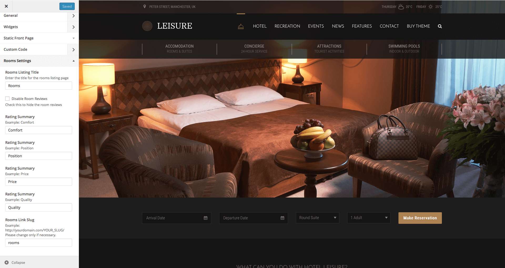
Rooms Listing Title – Here you can type in the name for the Rooms Listing page.
Disable Room Reviews – Check this box if you do not want to allow visitors to leave a review on the Room pages.
Rating Summary – Here you can type in the criteria for ratings. Examples: Comfort, Position, Price, Quality.
Rooms Link Slug – Here you can type in the link slug for the Rooms Listing page. It is not recommended to change it.
Static Front Page Section
curlythemes.com/support/docs/leisure-wp-theme
Static Front Page Section
Front page displays – Choose how your front page should look. Available choices are: Your latest posts or A static page. Default: Your Latest Posts
Front page – Choose your front page. Default: none
Posts page – Choose your posts page. Default: Blog
Posts Listing Style – You can choose here the size of your featured images in the Blog page. Available options are List with large image and List with small image. The default selection is with large images.
Posts Description – Drag the bar to the number of words you want to use in the description excerpt for each article in the blog listing.
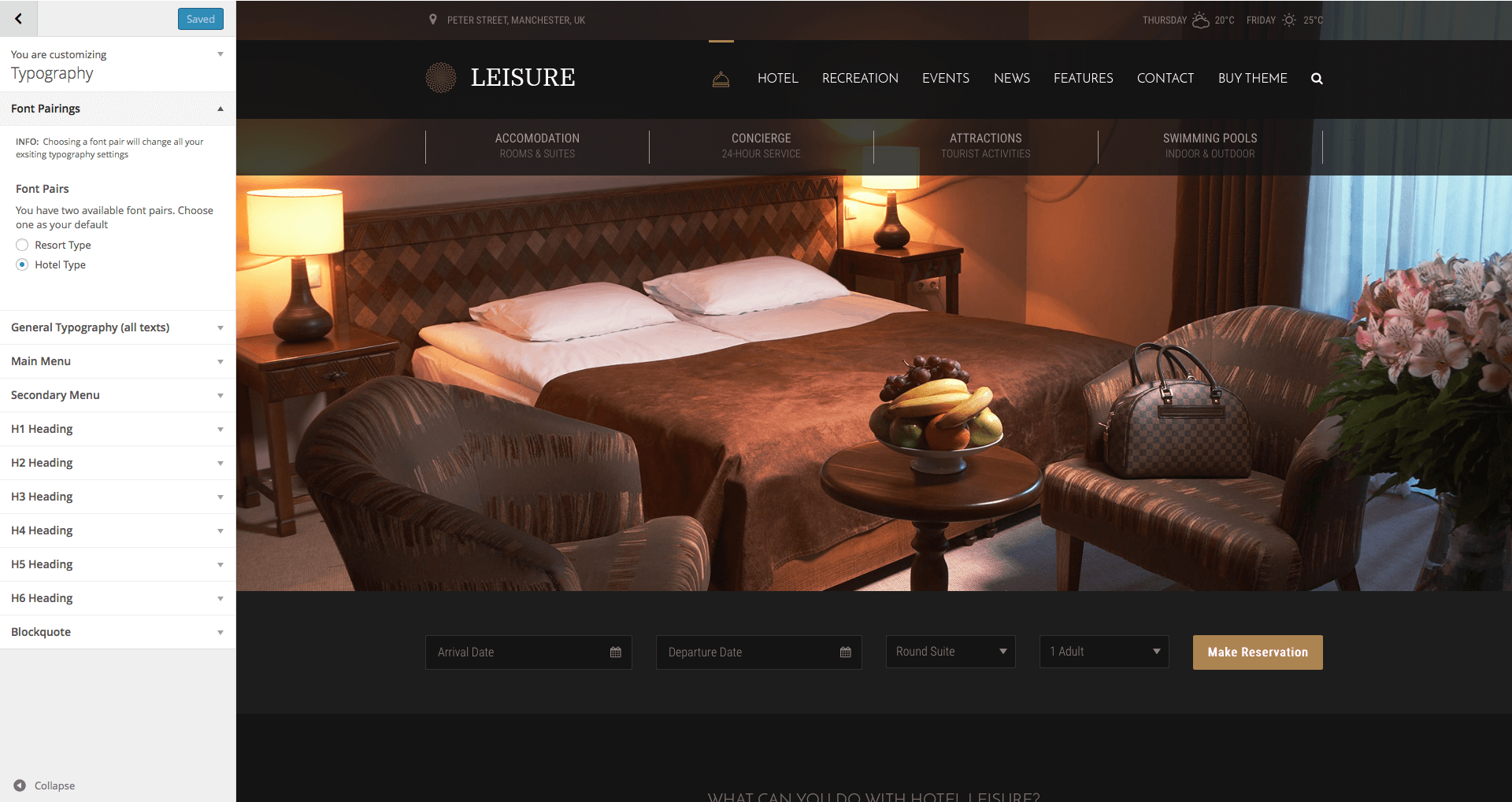
Font Family – Select the general font family for your website.
Font Style – Select the general font style for your website.
Font Variant – Select the general font variant for your website.
Font Size – Select the general font size for your website.
Include Special Characters – If you wish to use a subset for special characters you can select one here. Make sure the fonts you use on the website support these special characters.
Font Family – Select the general font family for your blockquotes.
Font Style – Select the general font style for your blockquotes.
Font Variant – Select the general font variant for your blockquotes.
Font Size – Select the general font size for your blockquotes.
Setting up the Pages
To create pages for your website you should login to your WordPress Dashboard and go to Pages > Add New. It is strongly recommended to use a Page Template for your pages, as you will take advantage of the integrated features. For example, a Contact Page Template will offer customized features for Contact pages.
Leisure WP Theme comes bundled with Visual Composer, a great and cool method to build pages easy, fast and with a lot of features. In conjunction with the Visual Composer, you can use Shortcodes for different features and CSS Classes for styling.
Ninja Forms
Ninja Forms is the ultimate FREE form creation solution for WordPress. Build WordPress Forms within minutes using Ninja Forms powerful forms creation page. It allows you to easily and quickly design complex forms through a drag and drop interface and absolutely no code. But for you developers it has a ton of hooks and filters so you can do absolutely anything with this powerful form building framework.
We have extended the great Ninja Forms plugin by adding new features so that you will enjoy using it more. If you are looking for even more extensions for Ninja Form they have a very cool extension marketplace, that you can visit here: Ninja Form Extensions Marketplace
Please note, when using a Ninja Form Extension, you should check the box Submit via AJAX (without page reload)? in the tab Settings, when editing the form.
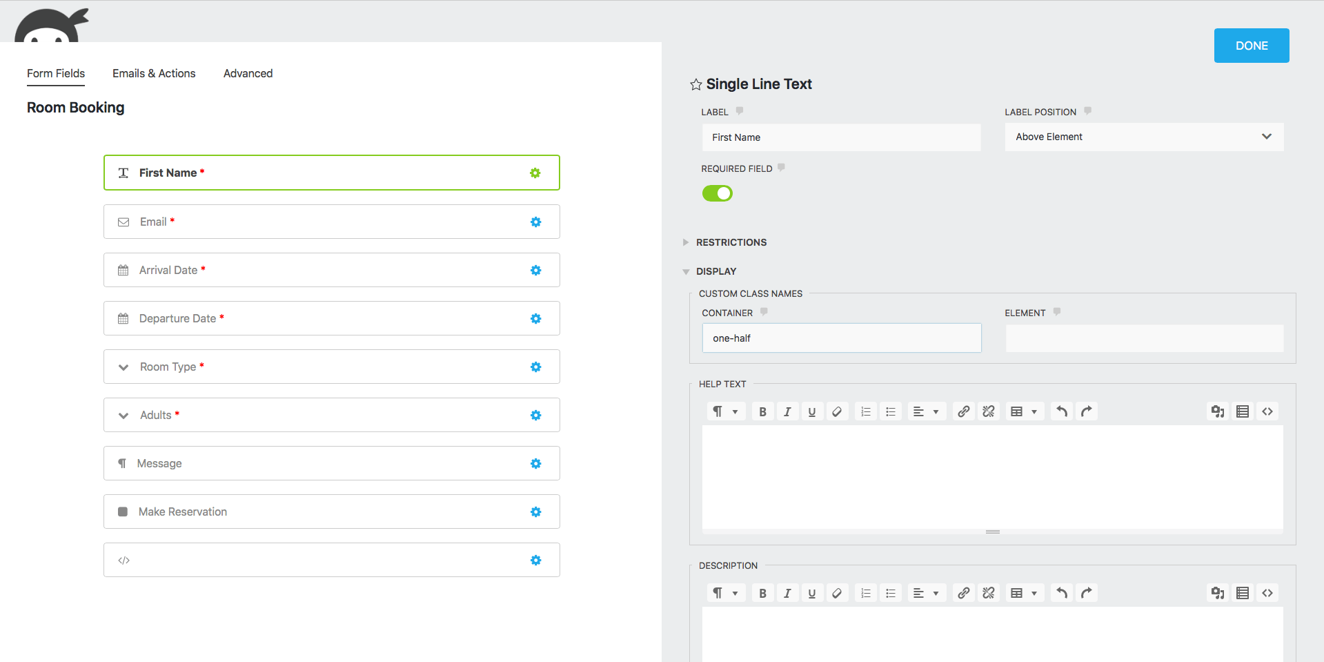
You can adjust your form layout in the Form Fields tab while editing your form. In this tab you can easily arrange your form fields by following the next steps:
Step 1 — Each field has a Container box under Display options. In this Container box you need to add the size you wish for that field. Sizing works like this:
Leave the box empty for a full width box
one-half is a half width box. Two 1/2 boxes will have room next to each other
one-third is a one third width box. Three 1/3 boxes will have room next to each other
two-thirds is a two thirds width box. One 2/3 box will have room next to a 1/3 box
one-fourth is a one quarter width box. Four 1/4 boxes will have room next to each other. Two 1/4 boxes will have room next to a 1/2 box
two-fourths is a two quarters width box. Same size as the 1/2 box
three-fourths is a three thirds width box. One 3/4 box will have room next to a 1/4 box
one-sixth is a one sixth width box. One 1/6 box will have room next to a 5/6 box
two-sixths is a two sixths width box. Same size as 1/3 box
three-sixths is a three sixths width box. Same size as a 1/2 box
four-sixths is a four sixths width box. Same size as a 2/3 box
five-sixths is a five sixths width box. One 5/6 box will have room next to a 1/6 box
Step 2 — Drag the fields around to arrange them how you want. Make sure they fit next to the items you want to place them
white-box — Adds a white background of 85% opacity. It has no padding by default. In conjunction with classes content-padding and content-padding-xs it will add top bottom, left, and right padding of 56 pixels and 32 pixels respectively.
white-box-mobile — Adds a white background of 85% opacity for mobile devices
background-none-mobile — Removes any background image for mobile devices
Revolution Slider
Create a responsive (mobile friendly) or fullwidth slider with must-see effects while meanwhile keeping or building your SEO optimization (all content always readable for search engines). See the heaps of custom transitions/animations for each object on the page! Customize this slider with our convenient drag&drop backend to your very needs.
This plugin features tons of unique transition effects, an image preloader, video embedding, autoplay that stops on user interaction and lots of easy to set up options to create your own effects.
To set a Featured Image for your blog post click on Set featured image in the Featured Image box, below Tags. Choose an image from the Media Library or upload a file from your computer and click on Set featured image.
It is strongly recommended to take a look at the Individual Page Settings located under the page content area.
After you are happy with the title, post content, categories, tags, featured image and everything else, click Publish and your post will appear on your blog page.
Setting up the Contact Page
Create a new page with a name of your choice and select the Contact Page Template, from the Page Attributes menu on the right. You can choose the desired template from Contact Page Template.
Go to Page Attributes > Template > Default Template to select the template for your homepage. We recommend importing our demo content and using our demo home page, that you can customize how you want.
It is strongly recommended to take a look at the Individual Page Settings located under the page content area.
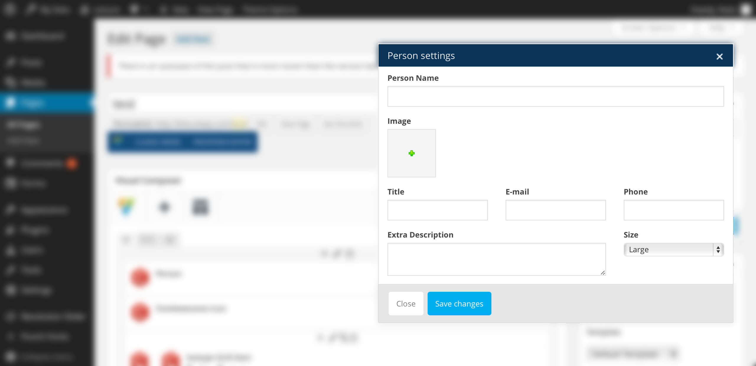
If you want to create individual pages for your rooms, you can use our dedicated tab that offers cool customization options for hotel websites. You can find Rooms as a separate tab in the WP dashboard, under the Comments tab. To enable Visual Composer for your room pages, go to Visual Composer > Role Manager > Post Types, select Custom and check the Room box.
curlythemes.com/support/docs/leisure-wp-theme
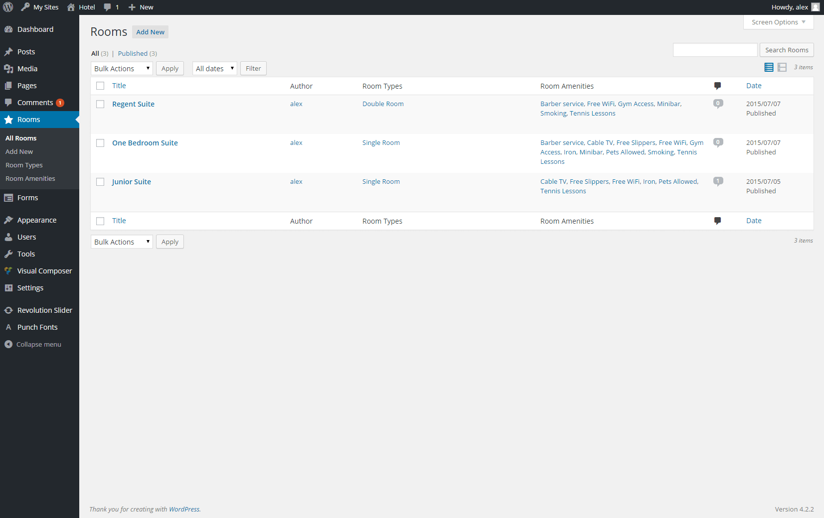
All Rooms
Go to Rooms > Add New to create a new room page, just like you would create a normal page. The room page has a default right sidebar and offers several custom features:
Room Types – You can use the Room Types box, from the right, under the Publish box, to assign a type to your room page. Go to Rooms > Room Types to create and manage your room types. Those will be displayed, for each room, in the auto generated Rooms Listing.
Room Amenities – You can use the Room Amenities box, from the right, under the Room Types box, to add amenities for the room. Go to Rooms > RoomAmenities to create and manage your amenities. Those will be displayed as icons for each room individually.
Page Gallery – Use the Page Gallery box, from the right, to upload images for the room. Those will be displayed on the individual room page, below the featured image.
Featured Image – Use the Featured Image box, from the right, to upload the featured image for the room page.
After you create your room pages, the auto generated Rooms Listing will display them in a column. Go to Appearance > Customize > RoomsSettings > RoomsLinkSlug to see the link for the Rooms Listing page.
You can edit the room pages from Rooms > All Rooms, just like you would edit your normal pages.
Please note: If you want to allow visitors to post Reviews on a room page, you need to check the AllowComments box, from the Discussion section, below Individual Page Settings.
Go to Rooms > RoomAmenities to create and manage your amenities. Those will be displayed as icons for each room individually.
Name – Type in the name for your room amenity. Examples: Free WiFi, Cable TV, Gym Access.
Slug – The link slug for the room amenity will be auto generated. You can type in a custom one.
Description – If you want, you can type in a description for the room amenity.
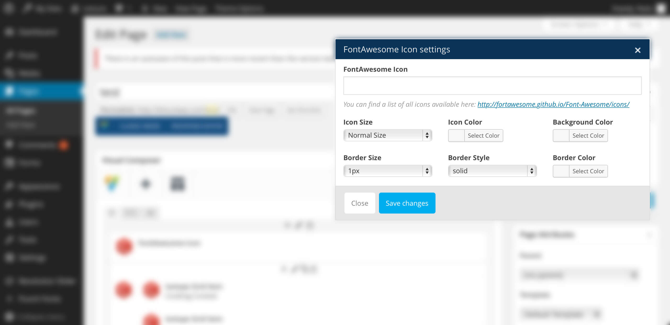
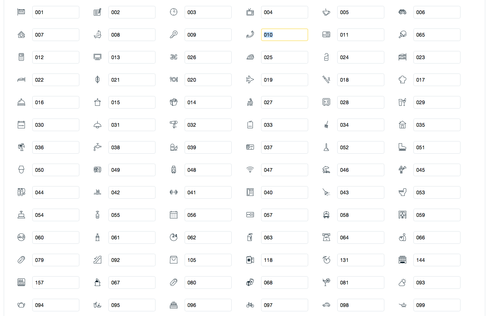
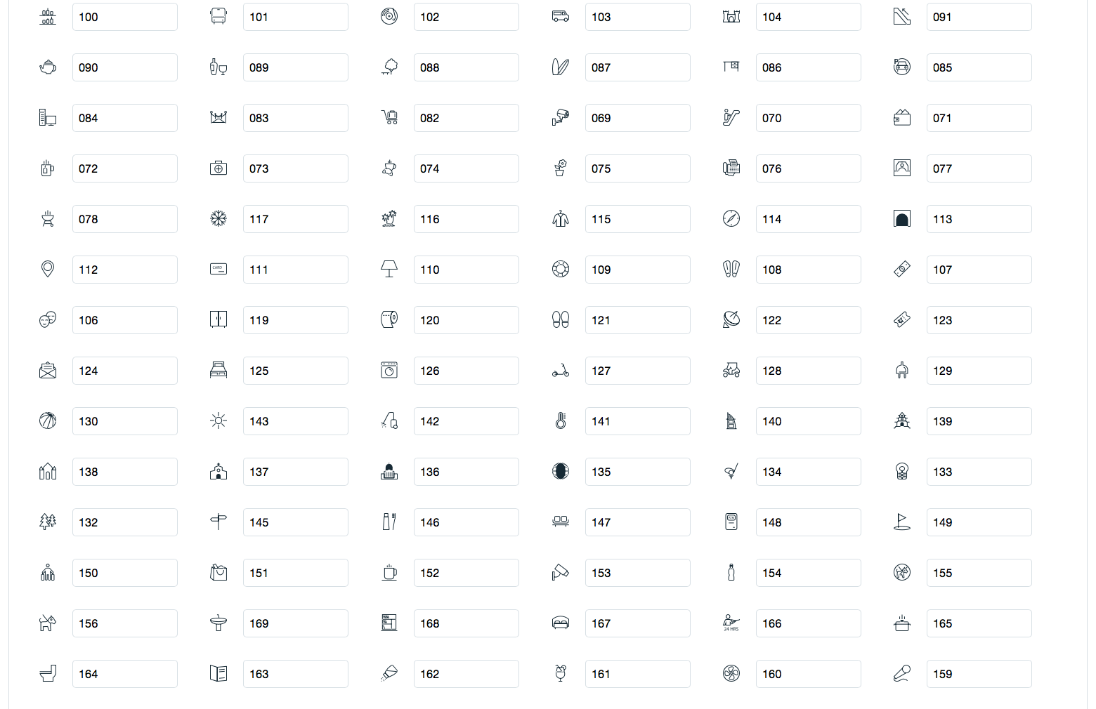
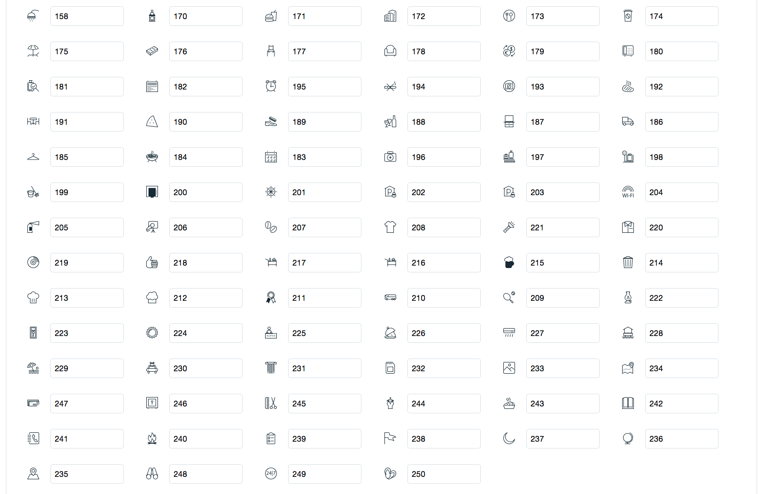
Amenity Icon – Type in the three digits number of the Hotel and Restaurant Icon you want to display. You can find the complete list in chapter 5.1. Icon Shortcodes.
Simple Weather
Simple Weather is a beautiful weather plugin that displays the weather via shortcode or via widgets. Add a simple, but very useful feature to your website, with this stylish plugin. Your visitors will know right away how to plan their schedule, happy to know the weather is on their side. Simple Weather is based on OpenWeatherMap.org.
Api: You can improve the overall performance of our plugin, if you use your own API Key from OpenWeatherMap.org.
Interval: By default, the weather updates with each page refresh. If you want to set a custom update interval, you can add a value, in minutes, to the shortcode. The value 0 means the default update, with each refresh.
Title: Choose widget title. If no title is entered, it will display the location as title.
Location Type: Choose how you will set the location: Location or Coordinates. If you choose Auto, the plugin will take the visitor’s location, through IP geolocation.
Location: You can choose the city and the country for the weather display.
Latitude & Longitude: You can enter coordinates for a location that cannot be found by name. Use decimal coordinates (ex: 43.343 & 12.4543).
Units: You can use Imperial ( Fahrenheit degrees) or Metric ( Celsius degrees) units to display the temperature.
Days: You can choose the number of days for the forecast. The maximum value is 7. If you choose None, it will not display a forecast for the next days, just the current weather.
Weather Check Interval: You can choose how often the plugin will update the weather info: every 10 minutes, every 30 minutes, every hour, every 2 hours or with each page refresh.
Language: You can choose the language* for the weather description (ex: Mostly Cloudy).
Background Color: Choose the background color of the widget.
Text Color: Choose the text color of the widget.
API Key (optional): You can use your own API Key from OpenWeatherMap.org. This will improve the general performance of our plugin.
¹ Available languages: English, Spanish, Italian, French, German, Russian, Ukrainian, Portuguese, Romanian, Dutch, Polish, Finnish, Turkish, Bulgarian, Swedish, Chinese Traditional, Chinese Simplified
Visual Composer
Visual Composer is a very unique plugin, it will help you manage your content for the WordPress sites and create stunning layouts, in a few minutes, without coding. Nowadays, many websites have complex grid layouts with columns, tabs, sliders etc. In the past, to create that type of layouts you had to be a HTML guru or a Shortcodes operator ninja.
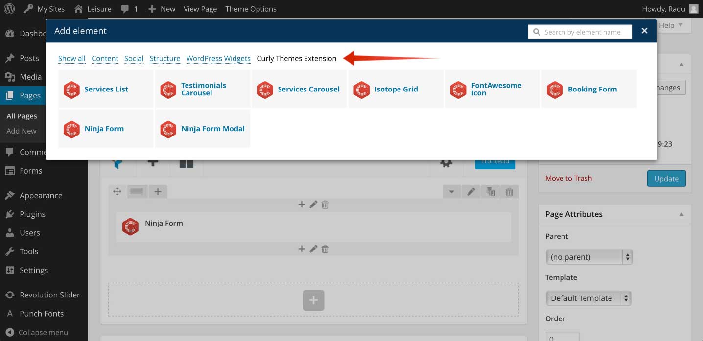
The Curly Themes Visual Composer Extension consists in bringing more options to the existing elements and register new elements that are located in the Curly Themes Extension tab, in the elements window. We have enhanced Visual Composer by eliminating some elements and parameters and added new ones.
curlythemes.com/support/docs/leisure-wp-theme
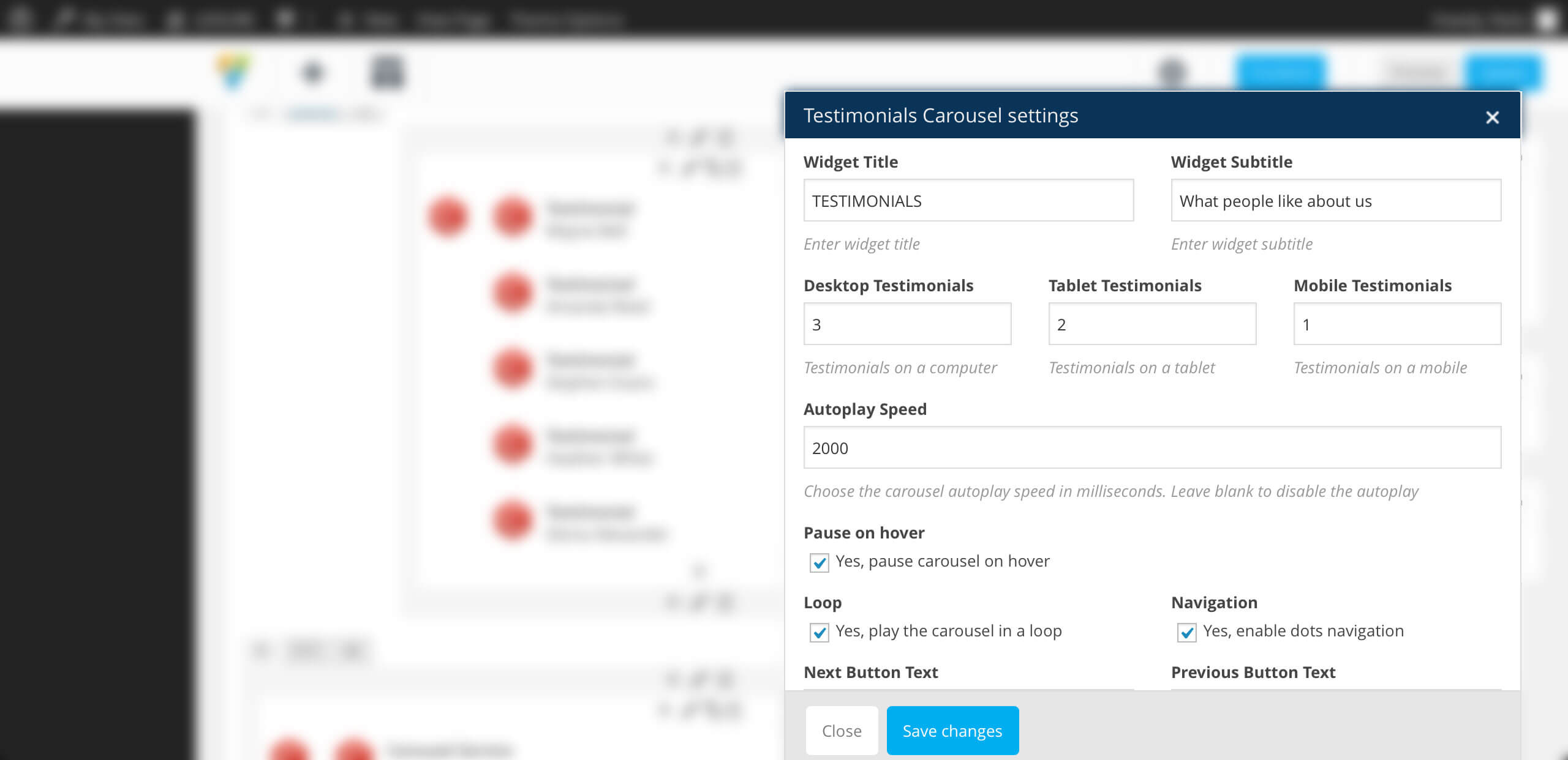
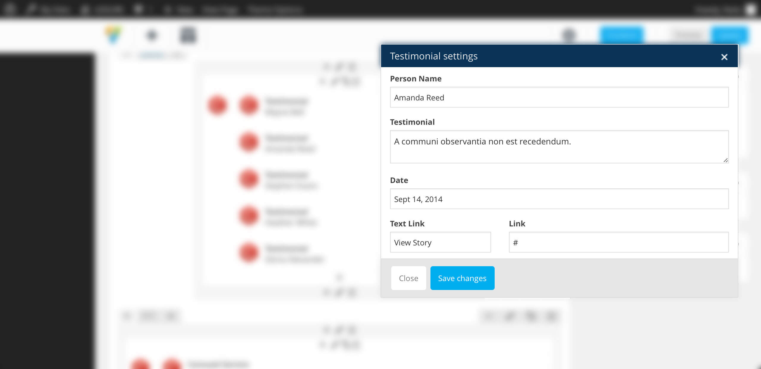
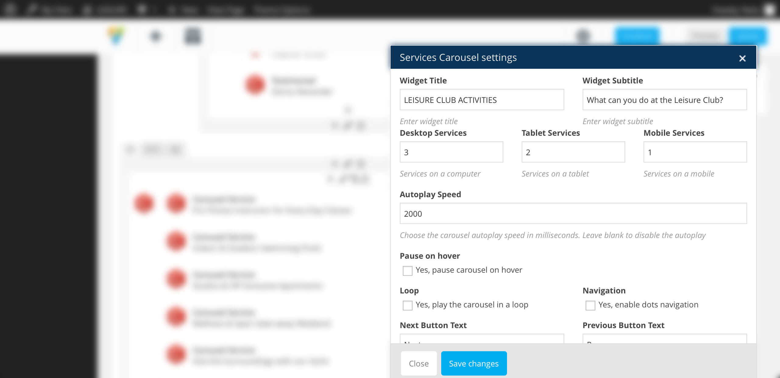
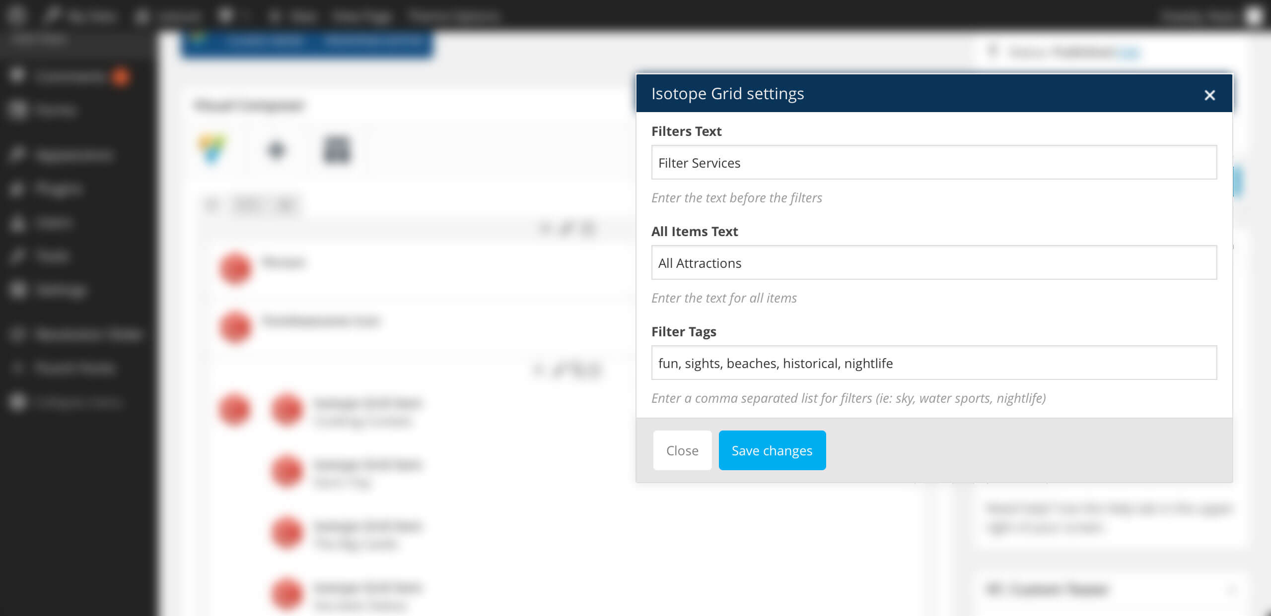
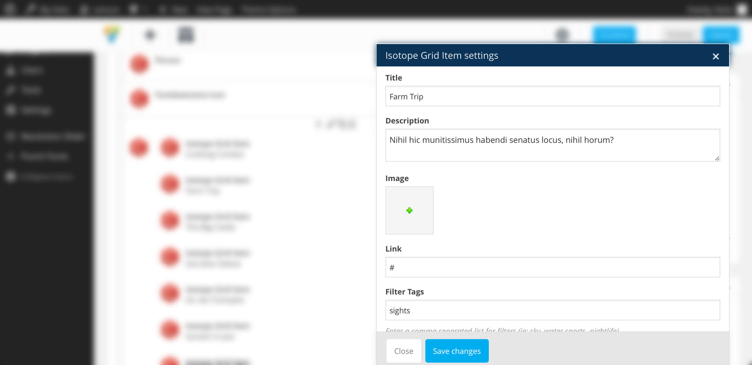
The **extended elements ** are: Row, Image Gallery, Image Carousel, Tabs, while the **new elements ** are: Services List, Testimonials Carousel, Services Carousel, Isotope Grid, FontAwesome Icon, Booking Form, Ninja Form, Ninja Modal Form.
Design Options > Background Image Position — Choose the background image position if you uploaded one before. Default: theme default
Design Options > Minimum Height — Enter a minimum height in pixels for your row. Default: none
Parallax > Enable Background Image Parallax -Check this if you want to add a parallax effect to the background image, if you uploaded one before. Default: unchecked
Parallax > Enable Background Image Parallax > Parallax Ratio — Enter the parallax ratio of the background image. Default: 0.5
Parallax > Enable Parallax Layers — Check this if you want to add up to three parallax layers in this row. Default: unchecked
Parallax > Enable Parallax Layers > Offset Parallax Layers — Enter the offset value in pixels for the row. Default: none
Parallax > Enable Parallax Layers > Style Parallax Images — Check this if you want to style the parallax layers. Default: unchecked
Parallax > Enable Parallax Layers > Parallax Layer (1, 2, 3) — Choose an image to use as a parallax layer. You can have up to three layers in each row.
Parallax > Enable Parallax Layers > Parallax Layer (1, 2, 3) > Vertical — Enter the initial vertical position for that specific layer in the row. Use values in pixels or percentage only relative to the top value. Default: none. Example: top: 20%
Parallax > Enable Parallax Layers > Parallax Layer (1, 2, 3) > Horizontal -Enter the initial horizontal position for that specific layer in the row. Use values in pixels or percentage only. Default: none. Example: right: 20%
Parallax > Enable Parallax Layers > Parallax Layer (1, 2, 3) > Parallax Ratio — Enter the parallax ratio for that specific layer. Default: 0.5
Parallax > Enable Parallax Layers > Parallax Layer (1, 2, 3) > Width — Enter the width for that specific layer in the row. Use values in pixels only. Default: image default. Example: 200px
Parallax > Enable Parallax Layers > Parallax Layer (1, 2, 3) > Height — Enter the height for that specific layer in the row. Use values in pixels only. Default: image default. Example: 200px
Parallax > Enable Parallax Layers > Parallax Layer (1, 2, 3) > z-index — Enter the layer order for that specific layer. Default: theme default. Example: 1
Video Background > Video Background Cover — Choose an image as your video background cover. Default: none
Video Background > External Video -Enter the external link for the video to be used as your video background. You can enter Vimeo and YouTube Links. Default: none
Video Background > MP4 File — Choose the .mp4 file to be used as video background. Default: none
Video Background > OGV File -Choose the .ogg file to be used as video background. Default: none
Video Background > WEBM File — Choose the .webm file to be used as video background. Default: none
Used to display a Booking Form. Has no child. Only works if Ninja Form WordPress Plugin is installed & activated. This element is used create a pre-fill booking form based on the complete booking forms fields.
Booking Form Parameters:
Ninja Forms — Select the ninja forms used for booking
Form Fields — Check which fields should be used for pre-fill
Design Options > Form Orientation — Choose the pre-fill form orientation. Default is vertical
Design Options > Forms Field Size — Choose the pre-fill form fields size. Default is normal
Design Options > Color Theme — Choose the pre-fill form color theme. Default is normal
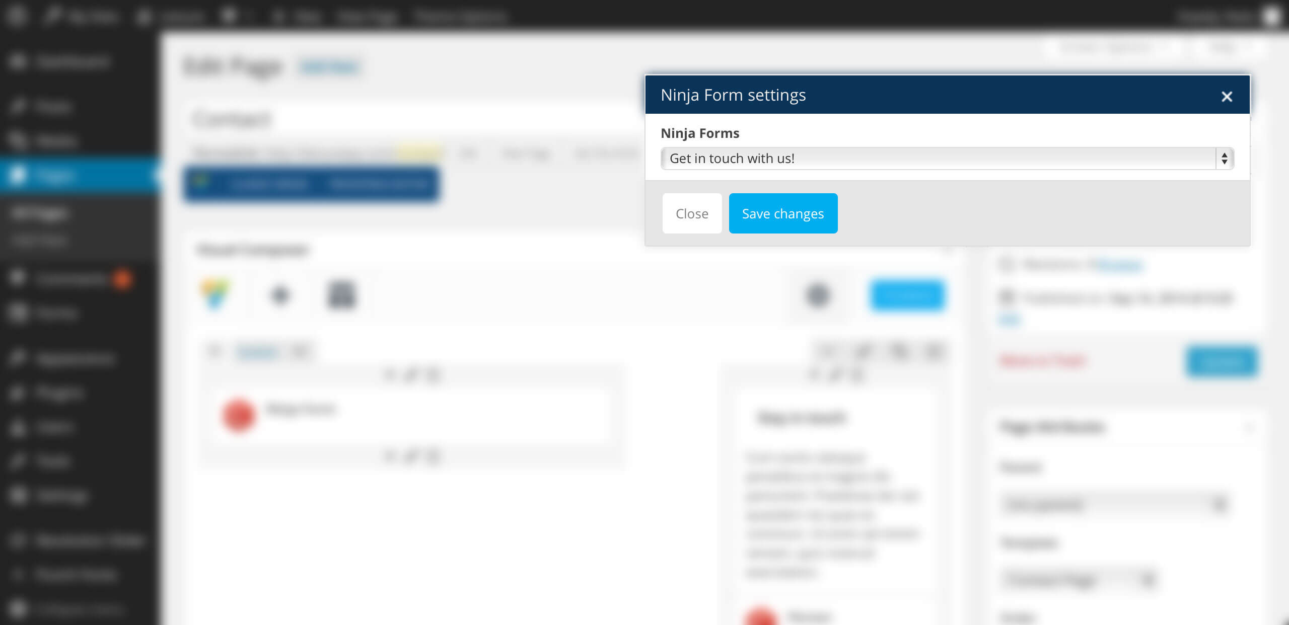
Used to display a Contact Form. Has no child. Only works if Ninja Form WordPress Plugin is installed & activated. This element is used to create a contact form.
Ninja Form Parameters:
Ninja Forms — Choose the contact form that you want to display
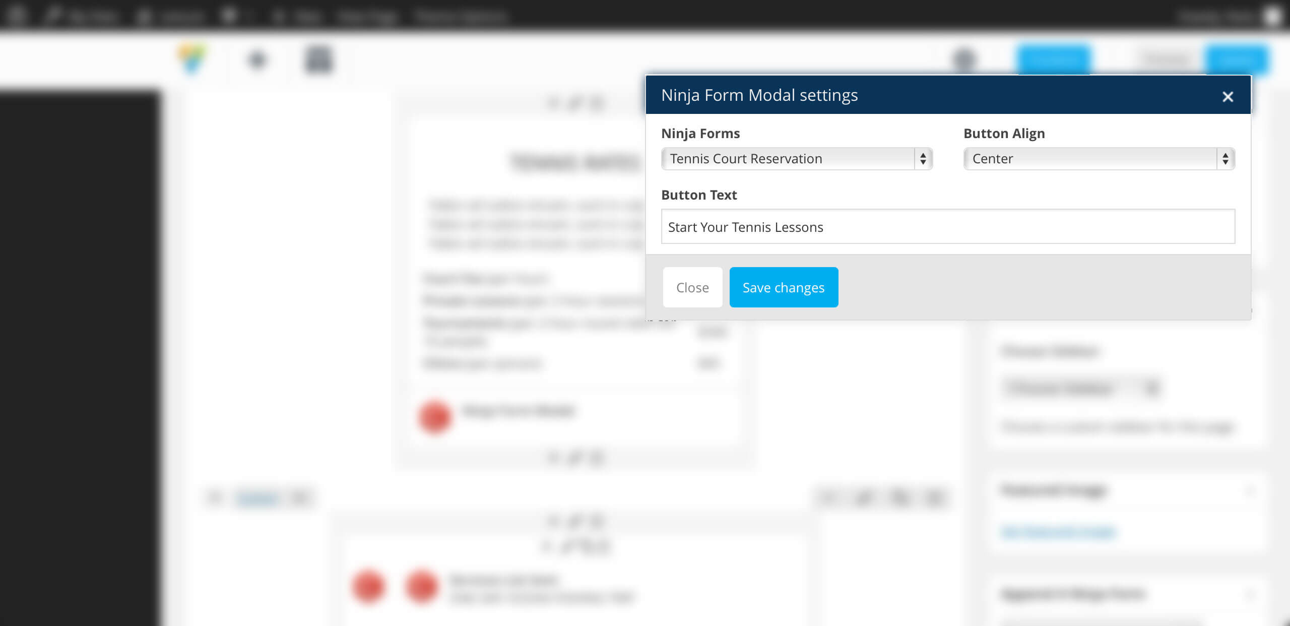
Used to display a button that opens a contact form in a modal. Has no child. Only works if Ninja Form WordPress Plugin is installed & activated. This element is used to create a contact form.
Ninja Form Modal Parameters:
Ninja Forms — Choose the contact form that you want to display
Button Align — Choose the button alignment
Button Text — Enter the button text
curlythemes.com/support/docs/leisure-wp-theme
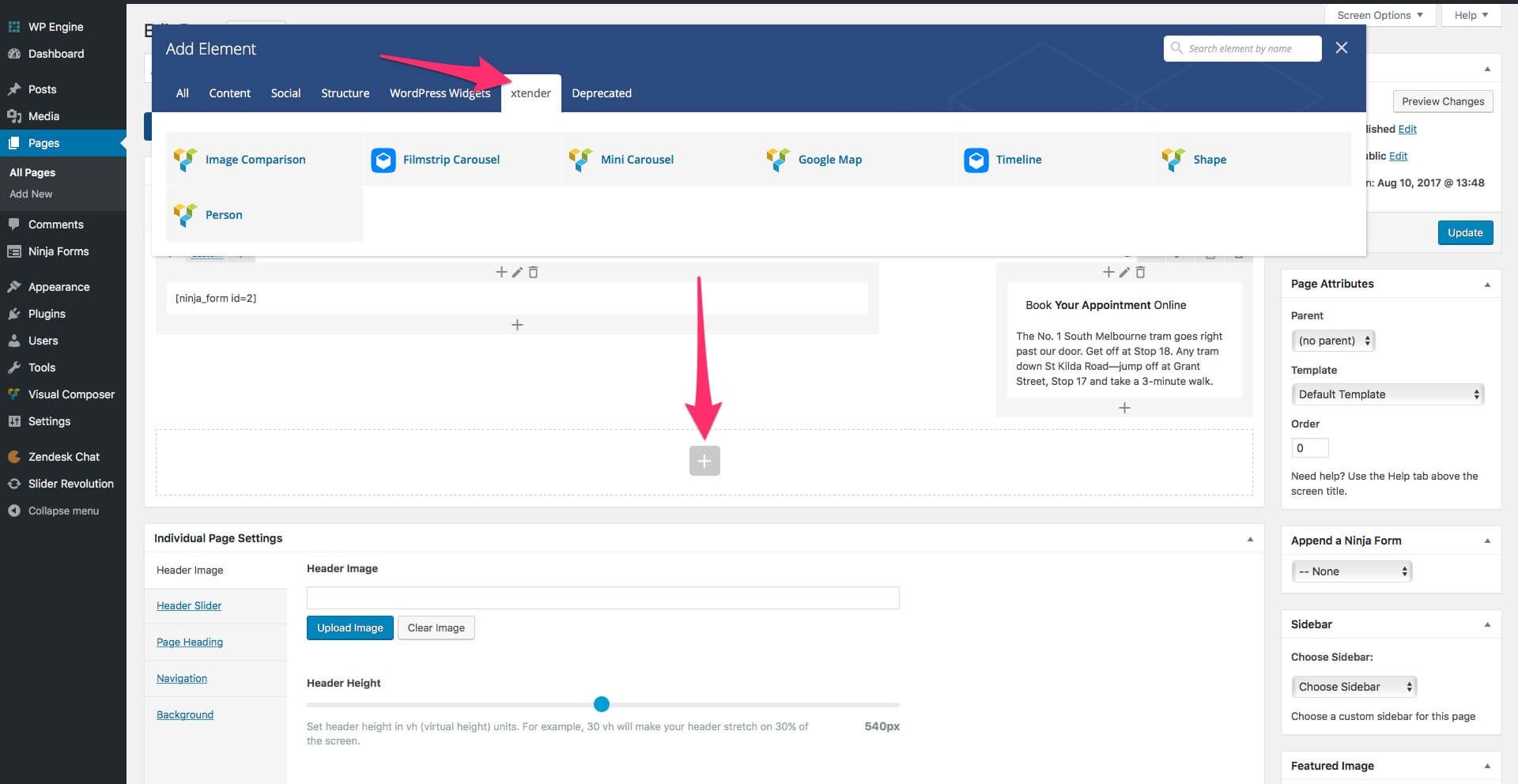
Using xtender plugin
Our custom xtender plugin brings powerful features and functionalities, making WordPress content building much easier. It is strongly recommended to use the theme only together with the xtender plugin, as the theme has been designed with the xtender functionalities in mind. The xtender plugin adds custom Visual Composer elements, Individual Page Settings, Shortcodes, Widgets and Sidebars generator.
size — Choose the size of your icon. Available values are: 2x, 3x, 4x, 5x. Default: none
boxed — Choose if you want your icon to be boxed. Available values are: yes / no. Default: none
border — Choose if you want your icon to have a border. Available values are: yes / no.
border-color — Enter the color name or color hex code for the icon border color.
boder-width — Enter the value in pixels for the icon border width.
border-style — Choose a style for your border. Available values are: none, hidden, dotted, dashed, solid, double, groove, ridge, inset, outset, initial or inherit.
color — Enter the color name or color hex code for the icon color. Default: text color
background — Enter the color name or color hex code for the icon background color. Default: none
link — Enter the URL address, if you want to add a link to the icon.
new_window — Choose the target for the icon link. To open the link in a new window use the value yes, default is no.
Buttons
Use this shortcode to display a custom button.
[button style=primary size=small link=http://www.curlythemes.com] Button Name [/button]
style — Choose the style of your button. Available values are: primary, secondary or link.
size — Choose the size of your button. Available values are: small or large.
outline — If you want a border for the button, use the value yes.
display — Use this if you want to display your button as a larger block. Available values: block.
link — Enter the URL for your button.
target — Enter the URL target for your button. Available values: blank.
Individual Page Settings
The Individual Page Settings box is a collection of features that take customization to a new level. Our Individual Page Settings box consists of: Contact Details, Page Title, Header Options and Background.
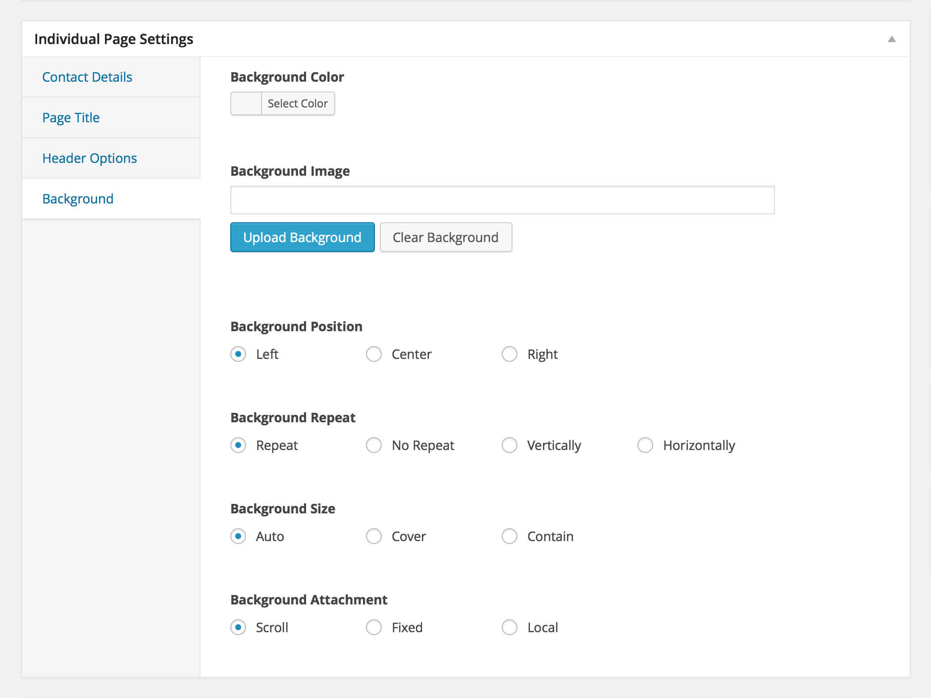
Background Options
Under any page or post content area you can configure the Background Options using the following options within the Individual Page Settings Box:
Background Color — The background color for your page / post
Background Image — The background image for your page / post
Background Position — The background image position; accepted values are standard CSS3 values; See details about CSS3 Background Position
Background Repeat — The background image repeat method; accepted values are standard CSS3 values; See details about CSS3 Background Repeat
Background Size — The background image size; accepted values are standard CSS3 values; See details about CSS3 Background Size
Background Attachment — The background attachment attribute; accepted values are standard CSS3 values; See details about CSS3 Background Attachment
Note: Customization made in this section will only be applicable to this specific page or post. This option will override the general website background options
curlythemes.com/support/docs/leisure-wp-theme
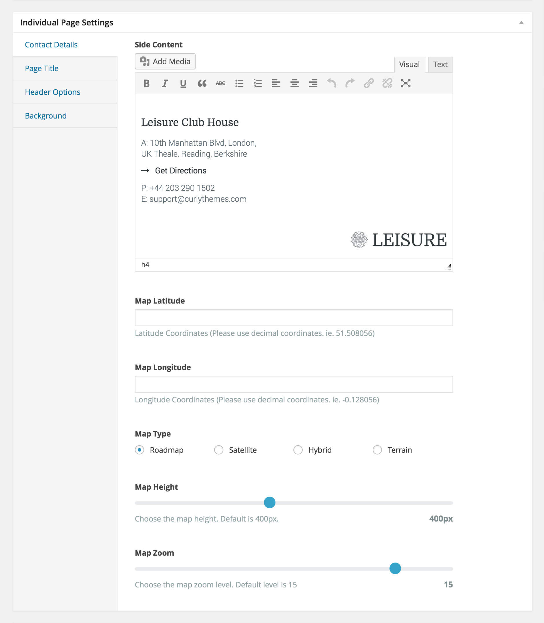
Contact Details
Under the contact page content area you can configure the Contact Details using the following options within the Individual Page Settings Box:
Side Content: The Side Content is the secondary column of the contact page. You can insert content just like for the main page.
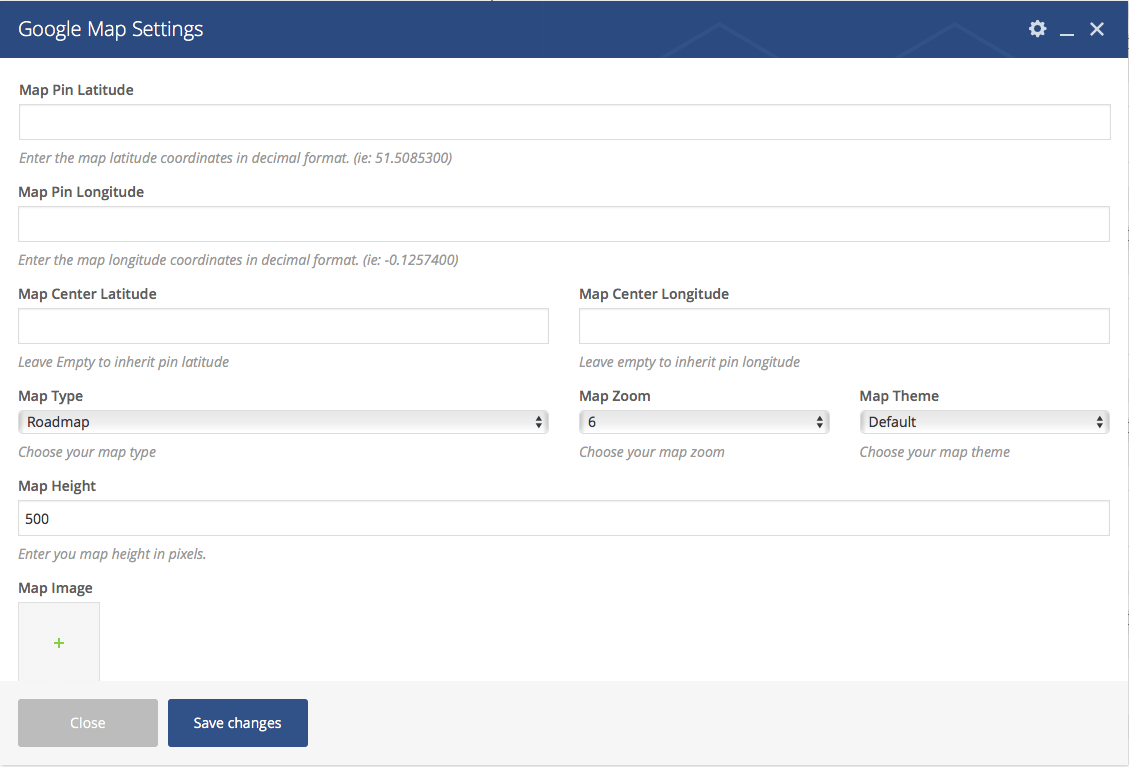
Map Latitude & Longitude: Enter the latitude and longitude coordinates so the map will show your desired location.
Map Type: Choose one of the four map types available. Default is set to roadmap.
Map Height: Enter the height of the map in pixels. Default is set to 500.
Map Zoom: Enter the zoom level of the map. Default is set to 15
curlythemes.com/support/docs/leisure-wp-theme
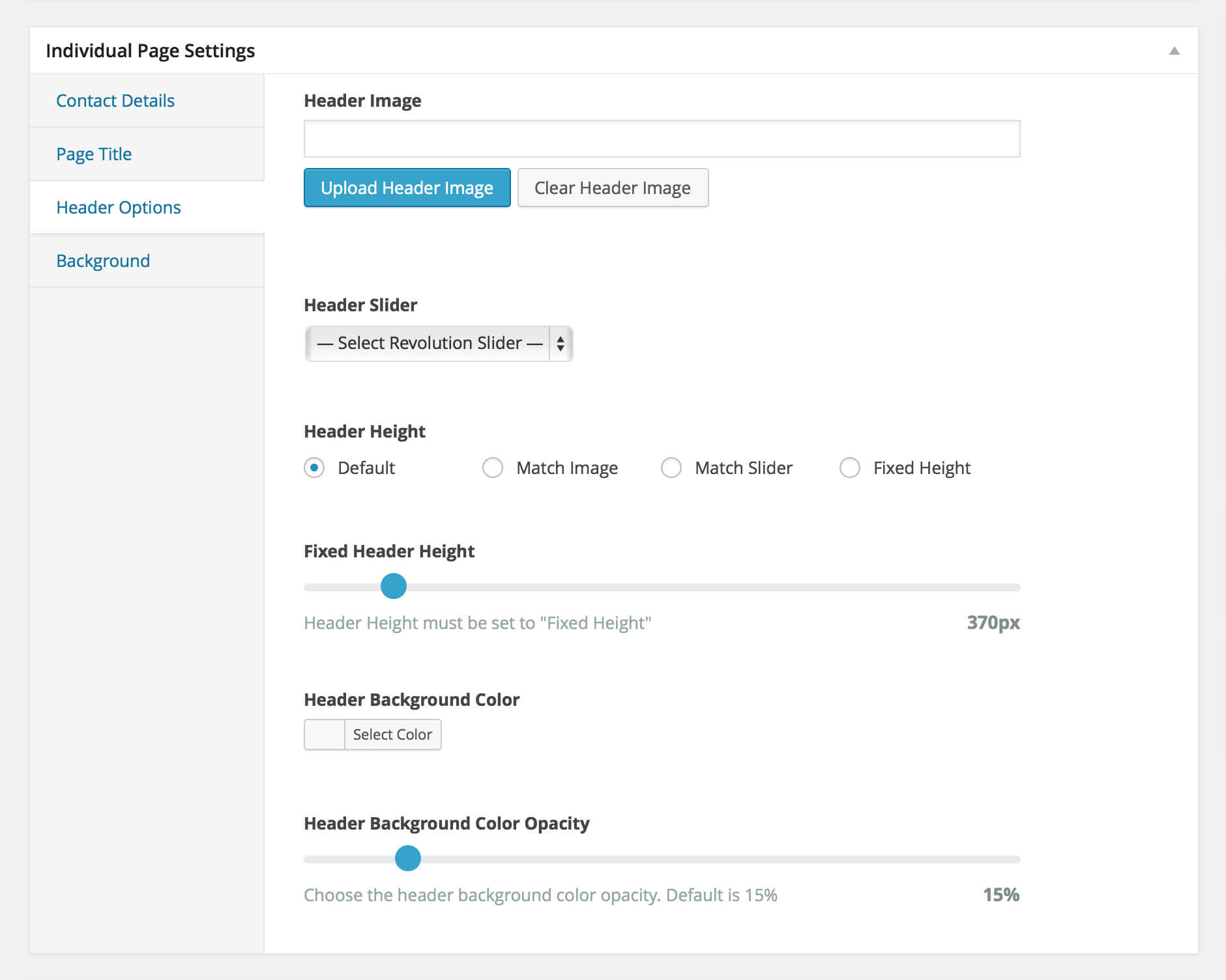
Header Options
Under any page or post content area you can configure the Header Options using the following options within the Individual Page Settings Box:
Header Image — Choose your custom header image. Default: global image / slider
Header Slider — Choose your header slider. This will override any other header setting. Default: none
Header Height — Choose the header height. Available options are:
Default — Theme default height. Default: 370px
Match Image — Match the header image height
Match Slider — Match the header slider height
Fixed Height — Fixed height
Fixed Header Height — Choose the header height
Header Background Color — Choose the header background color
Note: Customization made in this section will only be applicable to this specific page or post. This option will override the general website header options
curlythemes.com/support/docs/leisure-wp-theme
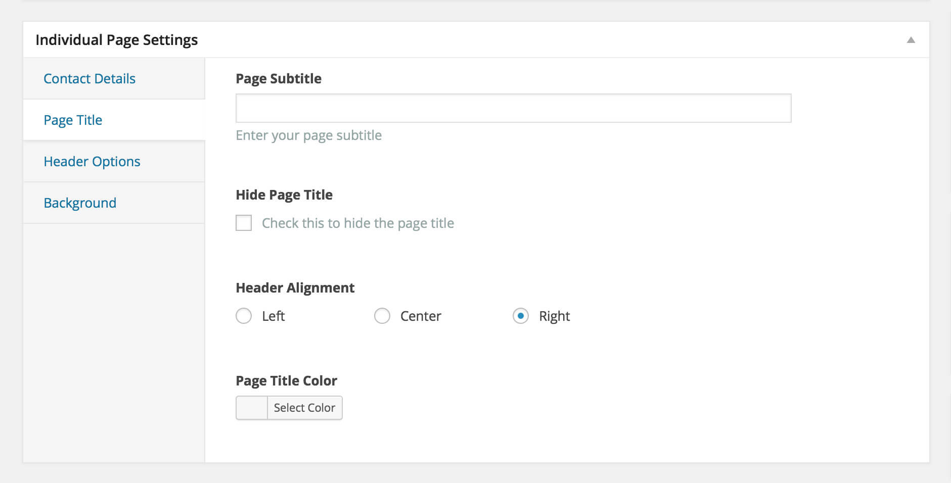
Page Title
Under your page content area you can configure the Page Title using the following options within the Individual Page Settings Box:
Page Subtitle: Enter the page subtitle. Default: none
Hide Page Title: Choose to hide the page title. Default: unchecked
Header Alignment: Choose how to align the header. Default: left
Page Title Color: Choose the page title color. Default: theme default (white)
curlythemes.com/support/docs/leisure-wp-theme
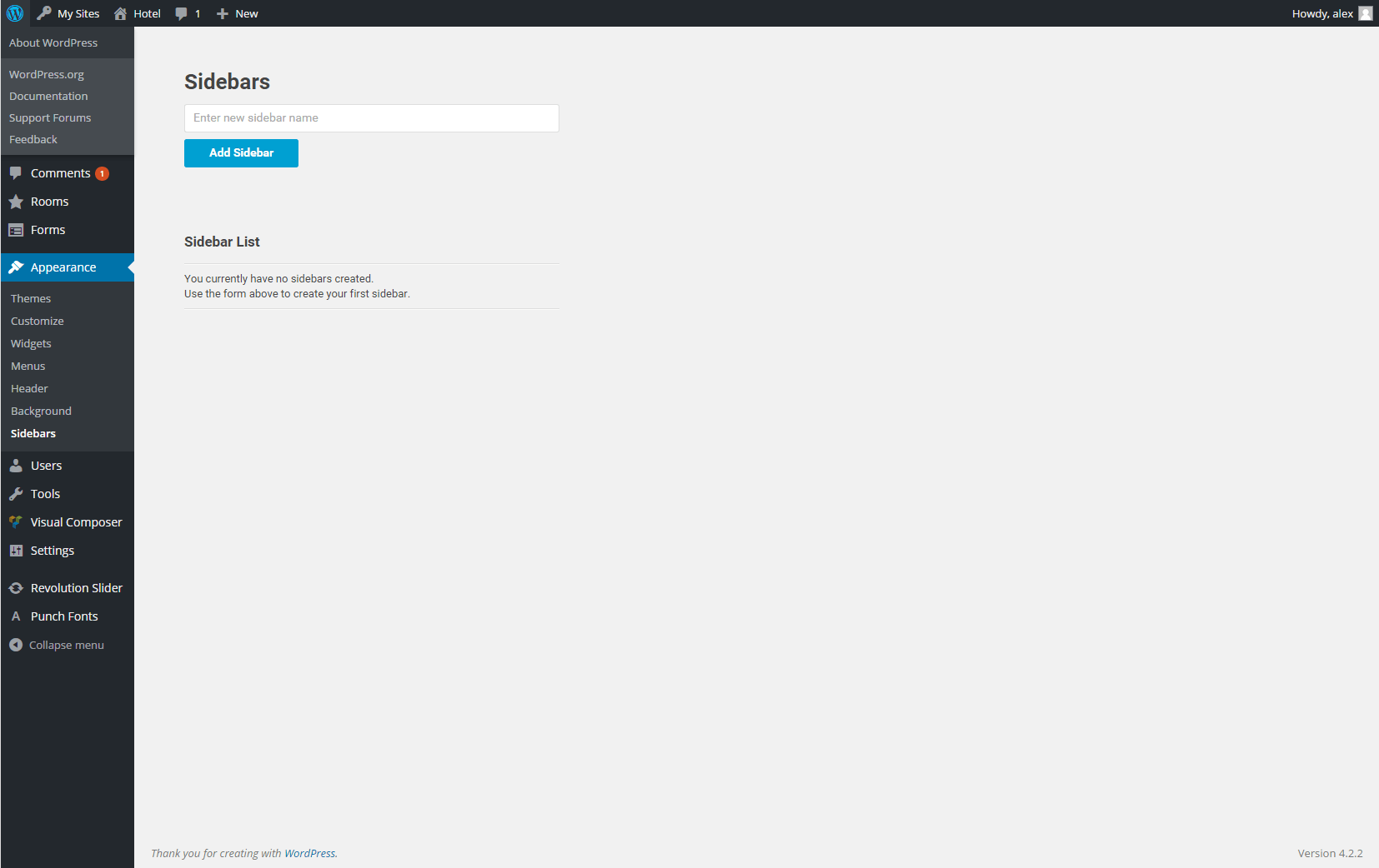
Sidebars
The Leisure theme offers you the possibility to create as many custom sidebars as you want, on any page, as long as the page template allows sidebars.
curlythemes.com/support/docs/leisure-wp-theme
All blog posts + blog pages support a sidebar. Also, Page with Left & Right Sidebar support a sidebar. To apply a sidebar to a page, go to the Sidebar Box, below the Page Attributes meta box, and use the select box to choose the desired sidebar..
You can create a sidebar by going to Appearance > Sidebars and clicking on the Add Sidebar button, after you type in the sidebar name . Next, you need to add widgets in the sidebar by going to Appearance > Widgets. The sidebar will appear on the right and you can drag and drop widgets from the left into the sidebar. Once you are done editing the widgets, you can add the sidebar to the desired page.
VC Elements
The xtender Visual Composer Extension consists in bringing more options to the existing elements and register new elements that are located in the xtender tab, in the elements window. We have enhanced Visual Composer by eliminating some elements and parameters and added new ones.
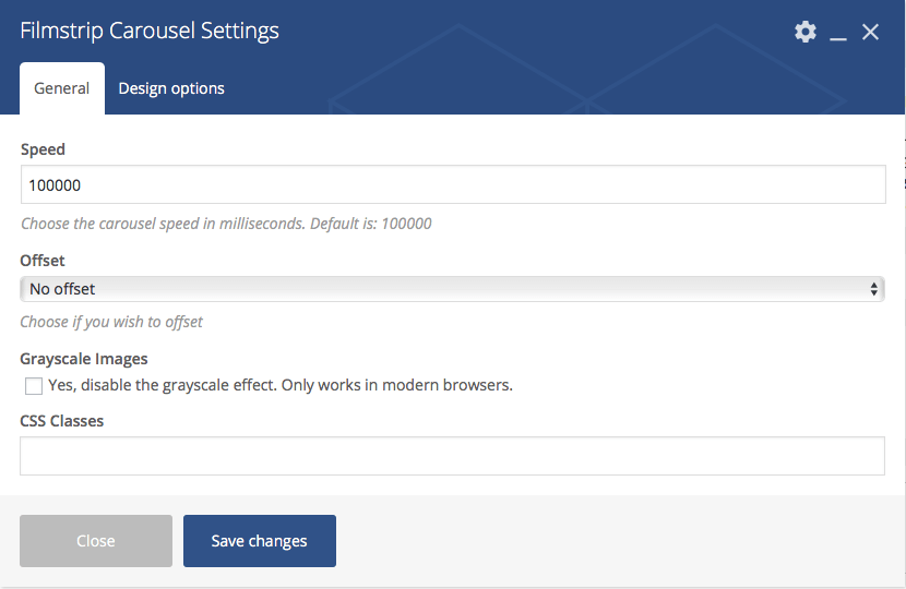
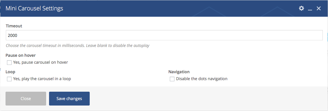
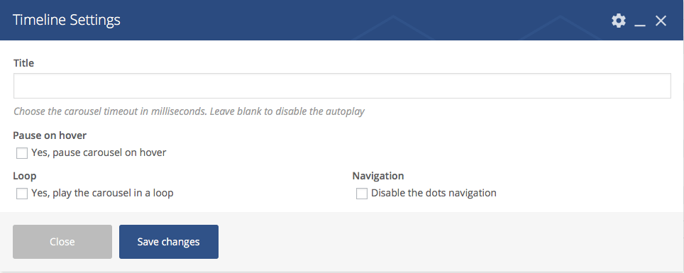
Timeout – Use this field to type in the timeout speed in milliseconds for the carousel. For example, 5.000 milliseconds is 5 seconds. If you leave the field empty, the carousel autoplay will be disabled.
Pause on hover – Check this box to pause the carousel on hover.
Loop – Check this box to play the carousel in a loop.
Navigation – Check this box to disable the navigation for the carousel.
CSS Classes – Use this field to add custom CSS classes.
The Mini Carousel element accepts only Single Image elements. The Single Image element is the default VC element with several new parameters.
You can use the Timeline custom VC element to build a stylish timeline of important events, with images and text. First, you need to add the Timeline element in page. Then, you can start adding Timeline Items. Inside the Timeline Item container, you can add other VC elements, like text and images, which will be displayed as events on a timeline.
We have extended the default Single Image VC element with several new parameters:
General > On click action – Use the select box to choose the action for a click on the image.
General > Image style – Two custom additional image styles: Small White Frame with Shadow and Large White Frame with Shadow.
Design Options > Maximum Width – Use this field to define a maximum width for the image.
Design Options > Width – Use this field to define the width of the image.
Parallax > Enable Parallax – Check this box to make the image a parallax layer. If you check this box, you will have to define the parallax coordinates for the image.
We have extended the default VC Column with several new parameters:
Design Options > Vertical Padding – Use this select box to choose the padding of the column.
Design Options > Minimum Height – Use this field to define a minimum height for the column.
Widgets
The xtender plugin adds custom widgets that you can add to your Sidebars at Appearance > Widgets. Also, the widgets you add in the Footer Widget Area sidebar will display several custom options.
The xtender adds Widget Layout options to each widget in the footer, which will allow you to define rules for each screen size.
Widget Grid Size – Use this select box to choose a grid size for the widget, between 1-12 columns (except 7).
Widget Grid Offset – Use this select box to choose a grid offset for the widget, between 1-12 columns (except 7) or No Offset.
Widget Text Align – Use this select box to choose the alignment of the text in the widget.
Widget Visibility – Use this select box to hide the widget for desired screen sizes.
The CSS Classes field allows you to add custom CSS for the footer widget.
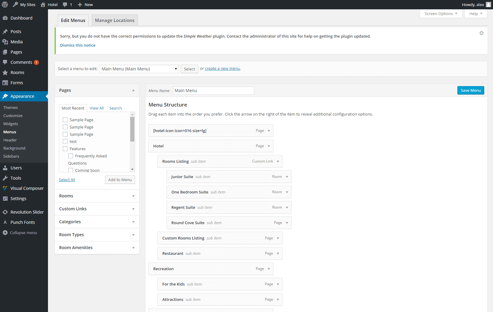
Setting up the Menus
The Leisure theme allows you to create custom menus, with up to three levels sub-menus depth. The menus can be used in two website areas: main menu and secondary menu. If you have imported the demo data, see chapter Importing the Demo Content for more details.
It is recommended to create the pages, even if they are blank pages, before creating a new menu. Next, go to Appearance > Menus, click the **Create a new menu ** button, type in a name for your menu and click on the Create Menu button. You can add pages to the menu by selecting them from the Pages box on the left. You can also use the Custom Links box to add pages by typing in the page URL and in the Label field the page’s name in the menu.
You can manage the menu structure by dragging and dropping pages in the menu box. To send a menu item a level deeper, drag the item below and slightly to the right of another menu item, that will become its parent section. After you are happy with your menu, from the Manage Locations Tab, use the Main Menu select box to choose the new menu. Click the Save Changes button to record the changes.
Setting up the Secondary Navigation
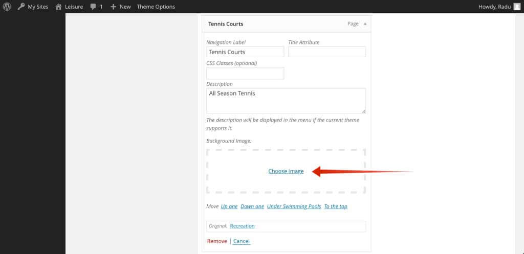
Leisure WP Theme has a nice Secondary Menu available throughout the site. The Secondary Menu is placed immediately below the main menu and is a beautiful 2 levels menu. Each of the level 1 menu items have the ability to have a nice big background picture for it’s children. You can set this background by clicking on the Choose Image link:
curlythemes.com/support/docs/leisure-wp-theme
Also you may want to click Screen Option on the upper right corner of the screen and then check Description; this will allow you to place a second row of text below each menu title.
Plugin Integration
The Leisure theme is a modern state of the art theme, ready for the most popular 3rd party plugins. Design elements have already been set up. You only need to install the plugin and it will be integrated in the website by default. Leisure - Hotel, Resort & Spa WordPress Theme is perfectly adapted for popular plugins like:
The most popular, easy to use plugin for e-commerce. All e-shop pages are adapted to the Leisure theme. To learn how to install the Woocommerce plugin go to WooCommerce and follow the detailed instructions.
The simple but flexible plugin for contact forms. All contact forms are perfectly integrated in the Leisure theme, the graphics will look great and natural. Go to Contact Form 7 to learn how to install the Contact Form 7 plugin and other detailed information.
Leisure theme is fully adapted to integrate popular SEO plugins like All in One SEO and Yoast SEO to help you boost your website rankings. Learn how to install All in One SEO Pack and Yoast SEO
The WordPress Multilingual Plugin is the most popular language localization plugin. Leisure theme has custom design elements integrated for the WPML plugin. Learn more about the WPML plugin by visiting the official website at WPML
You can use the WP-PageNavi plugin for a more advanced paging navigation interface. After installing it, the Leisure theme will automatically replace the default options with the WP-PageNavi options, no programming needed. Go to WP-PageNavi to learn how to install the WP-PageNavi plugin and other detailed information.
Use the Breadcrumb NavXT plugin to change the breadcrumbs design of the theme. After installing it, the Leisure theme will automatically replace the default options with the Breadcrumb NavXT options, no programming needed. Go to Breadcrumb NavXT to learn how to install the Breadcrumb NavXT plugin and other detailed information.
Use the Mail Chimp plugin to activate the newsletter on the bottom right of the screen. After installing it, the Leisure theme will automatically apply the styles. Go to Mail Chimp to learn how to install the Mailchimp plugin and other detailed information.
Use the bbPress plugin to add new community features to your theme. bbPress is a forum software with a twist, from the creators of WordPress. Makes setting up discussion forums inside your WordPress.org powered site an easy job. Go to the bbPress website to learn how to install and use bbPress.
CSS & JS Files
CSS Files: If you want to insert your own custom CSS code, you can use the Custom CSS field, located at Appearance > Customize > Custom Code > Custom CSS.
A theme update will overwrite all changes made. Insert all your custom CSS only in the Custom CSS field. It will override the all.css file and the changes will not be affected by an update.
Javascript Files: It is strongly recommended to avoid making any changes. If you consider you have the necessary knowledge and wish to edit them, we strongly recommend making a copy before.
If you want to insert your own custom JS code, you can use the Custom JS field, located at Appearance > Customize > Custom Code > Custom JS Code.
Child Theme
A great solution to keep all your customized options safe when updating is to create a child theme. In short, this is a WordPress theme, running alongside the original theme, with some customization overriding some original functions, without altering the original theme itself in any way.
You can create a child theme by uploading the leisure-child folder (unzip from download package) next to the leisure folder in the wp-themes folder.
Customizations made in the child theme folder will override the original theme. Files with the same names from the child folder will override the same files from the original theme. (ie. header.php in leisure-child will completely override header.php from leisure)
If you want to learn more about the child theme customization, please follow this link to read a comprehensible article.
Translating the Theme
The most comfortable and safe way to translate your theme is by using the popular WPML plugin. Install WPML Translation Plugin
If you choose to translate your theme without any translation plugin, the first thing you should do is to download and install Poedit. Alternatively, you can translate your theme without any external software, just by installing the Loco Translate Plugin.
The easiest way to translate your theme is by installing the Loco Translate plugin. Install and activate the plugin and then follow the instructions on how to translate the theme.
To translate the theme using Poedit you need to follow the next steps:
Open the en_EN.po in Poedit
Save as your new language. The filename of your .po is crucial. Gettext uses the ISO 639 standard for language abbreviations and ISO 3166 for locales. If your translation is written in American English for example, your file name will look like en-US.po. Capitalization is also important here. For a full list of language and country codes, check out these two links: Gettext language codes and Gettext country codes
Once you save, POEdit by default automatically creates a .mo file alongside your .po file. It is recommended to keep both files together.
Place the .mo and .po files in the languages folder located in the Leisure folder
The final step is to tell WordPress which translation file to use for your website. To do so you need to edit wp-config.php located in the root folder of your WordPress installation. When you open the wp-config.php file it should look like this:
/**
WordPress Localized Language, defaults to English.
Change this to localize WordPress. A corresponding MO file for the chosen
language must be installed to wp-content/languages. For example, install
de_DE.mo to wp-content/languages and set WPLANG to 'de_DE' to enable German
language support.
*/
define('WPLANG', '');
Your file should already contain define(‘WPLANG’, "); but if it does not, you can add it in. You simply need to add your language and locale code into the define.If you were to translate your theme into German, you would have this:
define('WPLANG', 'de_DE');
For more details about WordPress localization please visit the WordPress Codex: WordPress in Your Language
 purchase code