We provide Free Customer Support for all Curly Themes products through our quick and easy ticket application interface. Please limit your inquiries to problems related to the theme, its setup and features. For any problems concerning third-party plugins you should address the application’s developer.
Note: We can not offer support for custom CSS code customization. You should ask a professional developer for aid if you require help with advanced customization and programming.
Curly Themes offers a free ticket support application for all clients, through a real-time purchase code automatic verification. The dedicated app is fast and easy to use and includes an email notification feature. We will let you know as soon as your inquiry has received an answer. Thanks to our modern design, you can also upload images as an attachment to your support ticket.
Before writing a ticket please get your License Certificate:
Before opening a new ticket, please make sure you have read through all our documentation. Also, our Knowledge Base contains helpful answers to questions we often receive from our customers. Following these steps is in the users’ interest, as they will save valuable time. Still, we are always happy to respond to any inquiries you may have related to our theme.
Before installing this theme you need to have a WordPress platform already installed on your server. You can download it from WordPress.org if you don’t have it already.
If you do not know how or you have problems with the installation, you can access helpful information at:
Step 2 — Go to Appearance > Themes and select Arte.Step 3 — Click the Activate button and you can start using the theme.
Step 4 — It is strongly recommended that you install the theme bundled plugins:
Visual Composer is the most popular content building solution today, brings nice features such as shortcodes, widgets and other cool functionalities
Revolution Slider is a premium slider, provided along with the theme, for gorgeous showcasing
Contact Form 7 is one of the top form building plugins for WordPress
Events Schedule is a cool, smart plugin to display schedules with classes and events in WordPress
Xtender is a mandatory plugin for Arte, it brings core functionalities designed for art gallery websites
FTP Theme Upload
Step 1— The .zip file you downloaded from Theme Forest contains a folder named arte
Step 2 — Upload this folder on your server in your WordPress directory to /wp-content/arte/
Note: We recommend that you use FileZilla FTP client.
How to Update the Theme
Important: Before updating it is important to know that theme settings and content are not lost during the update process. You will lose changes to the theme files, if you changed any files. In order to prevent losing the file changes, we strongly recommend that you use child themes. Also, we recommend that you look in the release notes before updating.
The theme update can be done via FTP or via WordPress. Theme update can be done automatically or manually, depending on the method you prefer. Both methods are presented below as follows:
Auto-Update can be done directly from the Themes panel in your WordPress Dashboard.
Step 1 — To do this, you first need to set-up your Theme Forest Username & API Key in the special boxes, located at Appearance > Customize > Developer Tools > Automatic Theme Update.
Step 2 — To generate an API key, you need to login to your Theme Forest account and go to Settings > API Keys. Enter a label (ex: theme update) and hit the Generate API Key button.
You can also use Envato Market plugin, which will help you easy manage all your Envato products. You can find this plugin here: Envato Market Plugin
Manual Update can be done via FTP or via WordPress. No matter what method you choose, you first need to download the new theme files from Theme Forest. To download the new files, you need to follow these steps:
Login to your Theme Forest account, go to Downloads and search for Arte - Art Gallery WordPress Theme in your downloads list.
Click on the download button and choose the files you wish to download. You can either download the Installable WordPress Theme (this consists only of the theme files needed for update) or the Main Files package.
Now, based on your choice of install options, follow the method you prefer most:
Login to your FTP account and go to Wp-content > Themes. Delete the old folder called arte.
Unzip the new update previously downloaded. If you downloaded the Installable WordPress Theme, you will need only to unzip this file. If you downloaded the Main Files, you first need to unzip the Main Files, then you need to unzip arte.zip
Upload the arte unzipped folder to your Wp-content > Themes folder.
Login to your WordPress dashboard and head over to Appearance > Themes and deactivate Arte
Delete the old Arte theme.
Upload the new theme file. You can either upload the Installable WordPress Theme or unzip the Main Files package and upload the arte.zip file.
After uploading, activate Arte and you are done!
Importing the Demo Content
In the Arte download package you can find the Demo XML file (located in the wordpress xml data folder) that you can use for a quick theme set up. Images, videos and sliders are not included in the XML file. You can also import the WIE file, that contains our demo widgets.
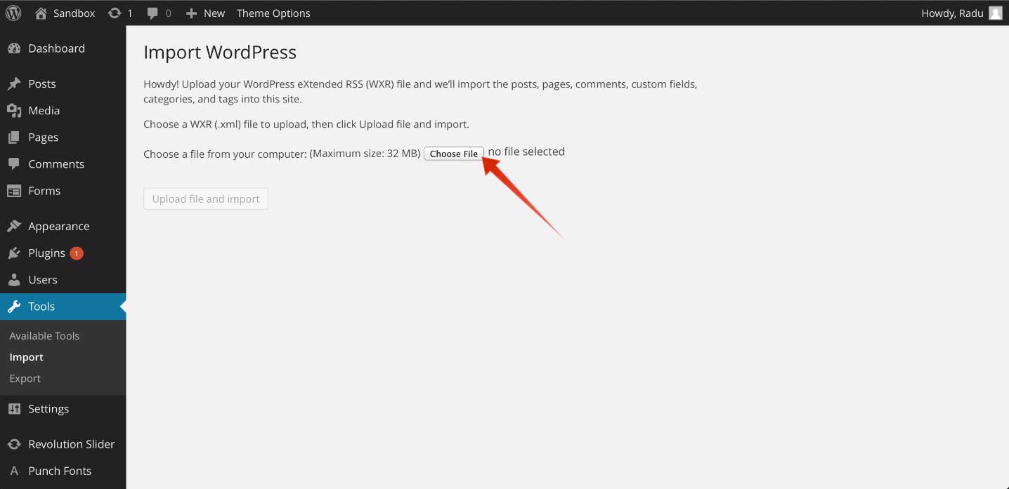
To import the demo XML file, in the WordPress dashboard go to Tools > Import and select to install from the list WordPress Importer. After the installation is complete, select and upload the XML file. You can find the demo XML file in the wordpress xml data folder inside the demo content folder in the Arte download package. In the demo content folder you will find four folders: events schedule, revolution slider, wordpress widgets and wordpress xml data, each of them with its relevant demo content. The process can take up to a few minutes.
To import the demo WIE file, go to Tools > WidgetImporter&Exporter and select and upload our WIE file. You can find it inside the folder wordpress widgets, inside the demo content folder.
Inside the wordpress xml data folder, you will find the XML file, which contains the demo.
After the import process, go to Appearance > Menus and from the Manage Locations tab, use the Main Menu select box to choose the Main Menu option. Click the Save Changes button to record the changes.
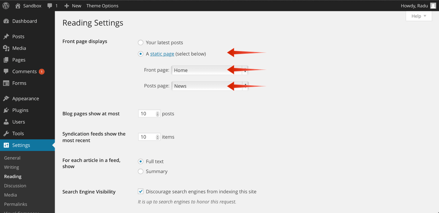
After this go to Settings > Reading and from the A static page radio button, use the Front page select box to choose your home and the Posts page select box to choose the page for your blog.
Note: If you have a problem loading the XML file, it might be caused by host limitations. You need to uncheck the Download images and attachments box to upload only your pages and posts.
In the Events Schedule demo folder you can find the XML file that you can use for a quick classes set up. Images are not included in the XML file.
To import the demo XML file, in the WordPress dashboard go to Tools > Import and select to install from the list WordPress Importer. After the installation is complete, select and upload the XML file.
After this, the imported posts will appear in your Events > All Events tab.
Note: In the Art Gallery WP theme, we renamed the Classes tab of our Events Schedule plugin as Events, for a more appropriate name for art galleries and similar businesses. The 3 taxonomies are now called Event Types, Locations and Artists.
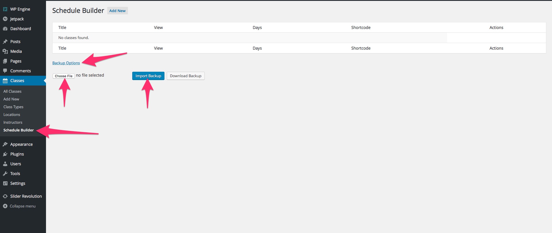
You can import also the demo schedules. In the Events Schedule demo folder you can find the JSON file that you can use for a quick schedules set up.
To import the demo JSON file you should go at Events > Schedule Builder and click on the Backup Options button, to reveal a row of buttons. Click on the Choose File button, to browse for the demo JSON file, select it and click on the Import Backup. If you wish to create a backup of your own schedules, you can use the Download Backup button, that will export your schedules in a JSON file.
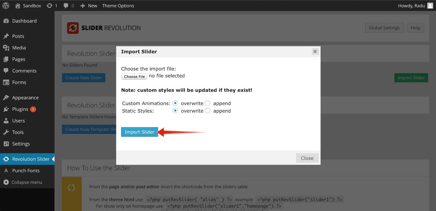
To import the slider used in the demo, you need to go to your Dashboard and then to Revolution Slider, click on Import Slider on the right side of the screen and select the demo slider located in the demo content folder, in the revolution slider folder, which contains the slider used in the demo.
The theme needs to be hosted on a server that is running WordPress 4.6 or higher, PHP 5.4 or higher, and MySql 5 or higher. Our WordPress Theme has been successfully tested with Mac, Windows and Linux. Also, to ensure that your experience is 100% safe, please follow the below checklist:
Make sure that your server is allowing WordPress to operate normally; some servers restrict WordPress functions, causing potential problems.
Please be sure to operate the latest version of WordPress available. To download the latest version of WordPress, you need to go to the official WordPress.org website.
Please make sure that you are using the latest version of the theme. To download the latest version of theme, you need to go to your Theme Forest account, under the Downloads tab.
Step 3 — Click Upload and select the file arte.zip from your computer, after this click the Install Now button.
Step 4 — Wait for the theme to be installed. Once installed, you will be notified.
Warning: Please make sure that you upload the arte.zip file and NOT the pack.zip file!
Quick Theme Setup
After installing the theme, the recommended plugins and the demo content, it is best that you configure your theme to your desire. Please follow the next steps for a quick setup:
From your Dashboard, head over to Appearance > Customize and start customizing the theme. Our smart options sidebar, on the left, lets you change anything and see the effects in action right away. The panel elements with a right pointing arrow have their own sub-panel. The elements with a downward arrow open their options in the same panel. Here is a short description of all sections and fields:
curlythemes.com/support/docs/art-gallery-wordpress-theme-documentation
Art Gallery Customizer
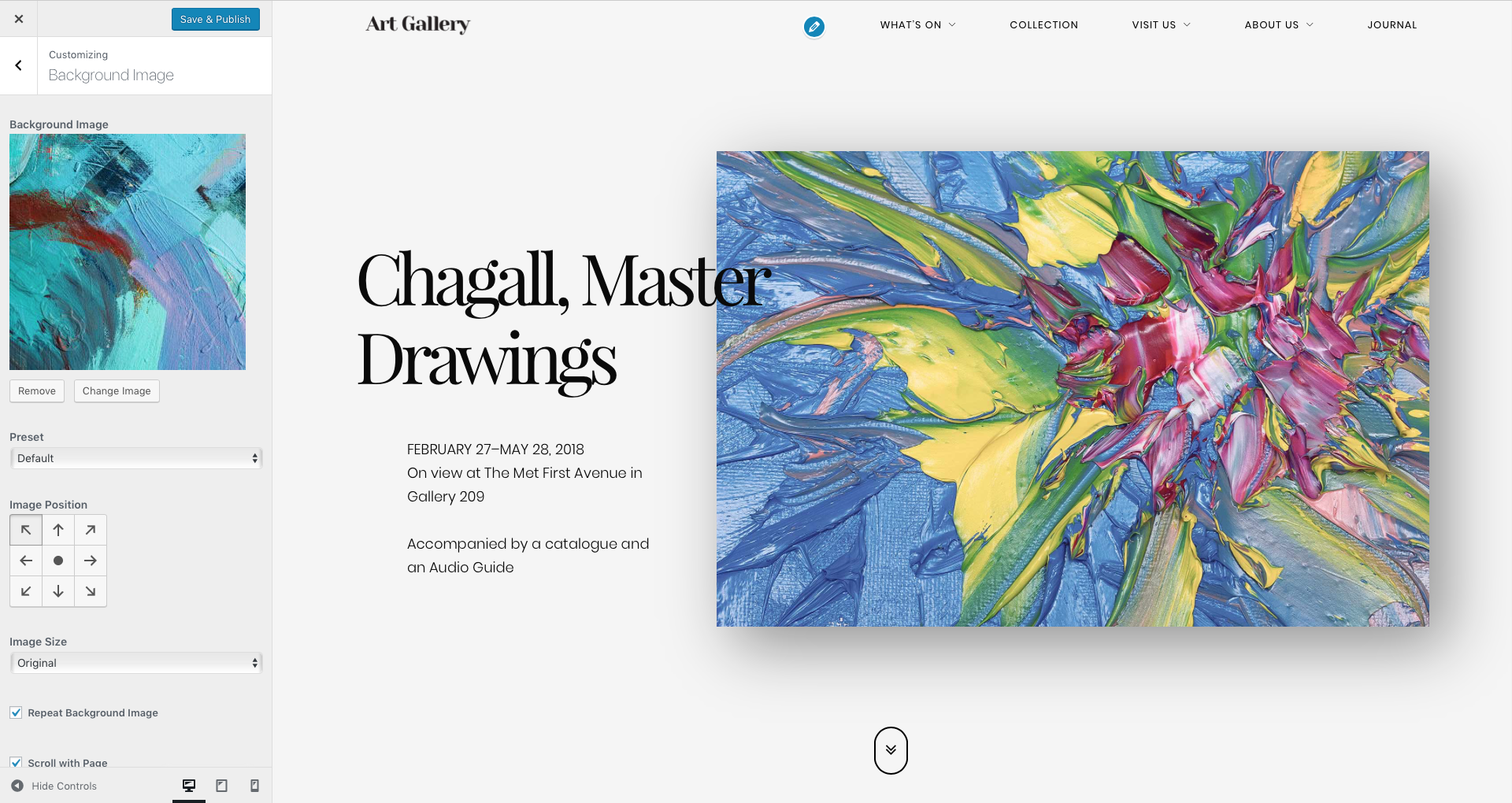
Background Image – Here you can upload a custom background image for your website. Default: none
Preset – You can choose how the background image will be displayed in the layout. Available options: Default, Fill Screen, Fit to Screen, Repeat and ** Custom**.
Image Position – You can choose how the background image will be placed in the layout by using the arrow buttons.
Repeat Background Image – If you select Fit to Screen or Custom preset options, you can check this box to repeat the background image in the layout.
Scroll with Page – If ** ** you select Repeat or Custom preset options, you can check this box to make the background image scroll in the page.
Image Size – If ** ** you select Custom preset option, you can choose the background image size. Available options are: Original, Fit to Screen, Fill Screen.
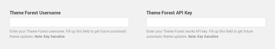
Theme Forest Username – Here you can type in your Theme Forest Username in order to get automatic theme updates.
Theme Forest API Key – Here you can type in your Theme Forest API Key in order to get automatic theme updates. To generate an API key you need to login to your Theme Forest account and go to Settings > API Keys. Enter a label (ex: theme update) and hit the Generate API Key button.
Note: Both Theme Forest Username & API Key need to be filled in to get auto-updates for the theme.
Custom CSS – If you want to use additional code, you can insert here your custom CSS code. This code will work globally, for all devices.
Small Devices CSS – If you want to use additional code for your website on small screen devices, you can insert here your custom CSS code. Small screen devices have a display with less than 768px.
Medium Devices CSS – If you want to use additional code for your website on medium screen devices, you can insert here your custom CSS code. Medium screen devices have a display with more than 768px and less than 992px.
Large Devices CSS – If you want to use additional code for your website on large screen devices, you can insert here your custom CSS code. Large screen devices have a display with more than 992px and less than 1200px.
Extra Large Devices CSS – If you want to use additional code for your website on extra large screen devices, you can insert here your custom CSS code. Extra large screen devices have a display with more than 1200px.
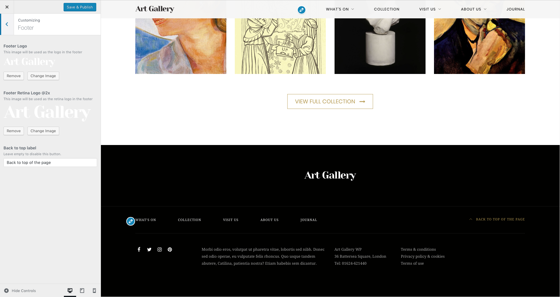
Footer Logo – Upload your footer logo here. Default: none
Footer Retina Logo @2x – Upload your footer retina logo here. Your footer retina logo should be double size than your normal footer logo. This will ensure that your footer logo will look crystal sharp on retina devices. Default: none
Back to top label – Add the text for the Back to top button. If you leave this field empty, the button will not be displayed.
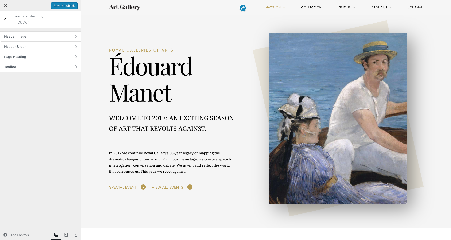
Art Gallery uses header images. The minimum recommended size for the header image is 1920 x 1080 pixels. This is a global setting and will affect all pages. Alternatively, you can have more images and display them randomly.Important: The global header images can be overridden by the Header Slider or by the Individual Page Settings.
Current header – Displays your current header image. You can Hide it or you can Add new image. If you choose to add more images, the header will choose, each time, a random one.
Previously uploaded – Displays the header images you uploaded.
Randomize uploaded headers – If you add more images, the header can choose, each time, a random one. Push this button to display a random image.
Header Height – Use this slide bar to select the minimum height of the header.
Image Repeat – You can choose how the header image will be repeated in the header. Available options: No Repeat, Tile, TileHorizontally and TileVertically.
Image Alignment – You can choose how the header image will be aligned in the header. Available options: Left, Center and Right.
Image Position – You can choose how the header image will be placed in the header. Available options: Top, Center and Bottom.
Image Attachment – You can choose how the header image will behave in the header. Available options: Scroll and Fixed.
Image Size – You can choose the size of the header image in the header. Available options: Auto for the default image size and Cover to stretch the image.
Before being able to set a header slider, you first need to create / import one from the Revolution Slider tab. After creating or importing a slider, select the header slider from the Header Slider field. By default, there is no header slider set.
Important: If you set-up a header slider, all header images will be overridden except the Individual Page Settings.
Navigation Position – Choose the alignment of your main menu. Available options: Left Aligned and Right Aligned.
Navigation Top Margin – Use this slide bar to select the margin in pixels between the top of the header and the navigation.
Navigation Bottom Margin – Use this slide bar to select the margin in pixels between the navigation and the bottom of the header.
Disable Sticky Menu – If you do not want to use a sticky menu, you can check this box.
Float Navigation – If you wish to use a lighter menu, you can check this box.
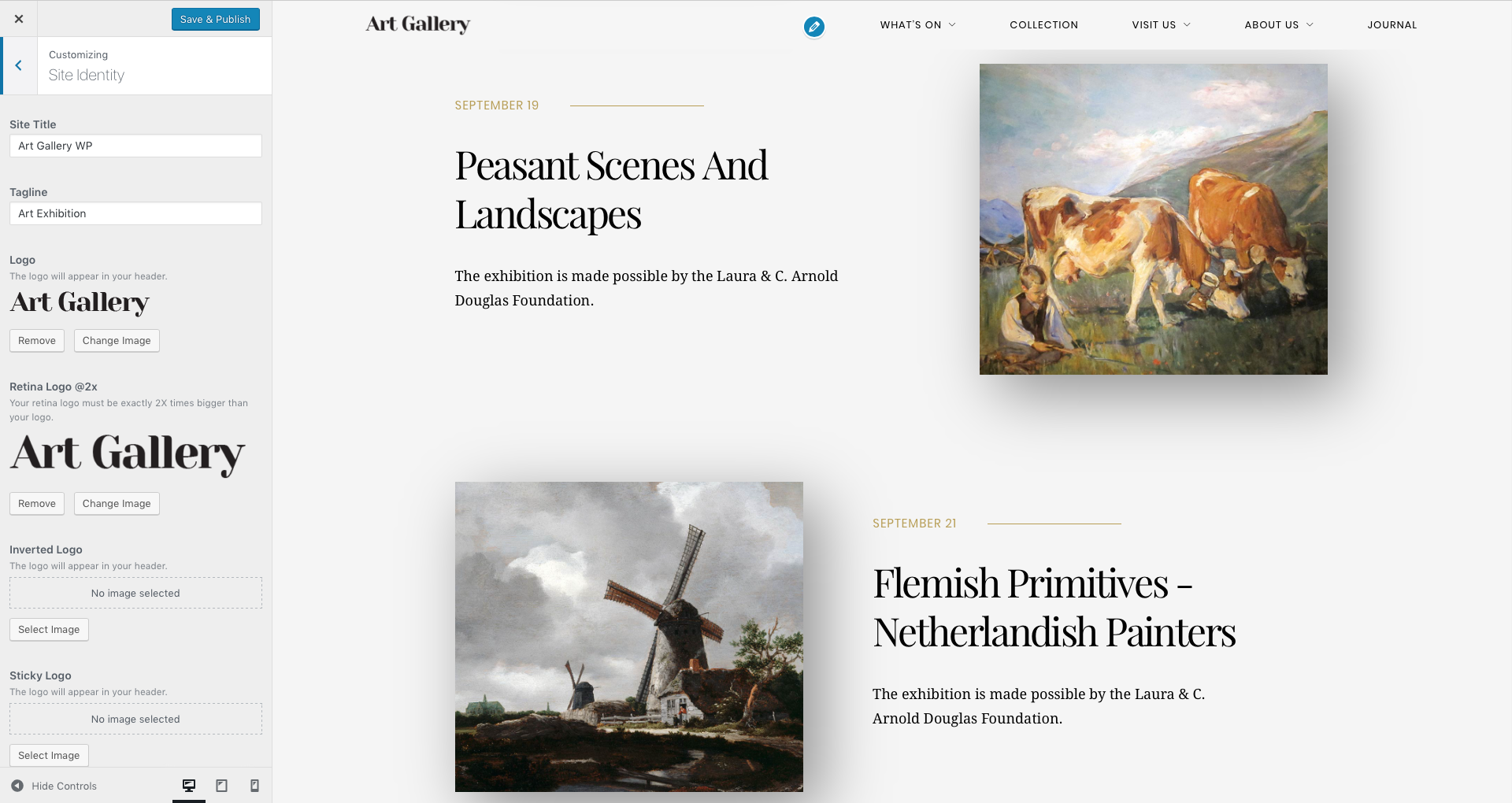
Site Identity
curlythemes.com/support/docs/art-gallery-wordpress-theme-documentation
Site Identity
Site Title – Enter your site title. Default: Art Gallery WP
Tagline – Enter your left tagline. This will be displayed only if you are not using a logo.
Logo – Upload your logo here. Default: none
Retina Logo @2x – Upload your retina logo here. Your retina logo should be double size than your normal logo. This will ensure that your logo will look crystal sharp on retina devices. Default: none
Inverted Logo – Upload your logo for inverted colors. Default: none
Inverted Retina Logo @2x – Upload your retina logo for inverted colors. Your inverted retina logo should be double size than your inverted logo. This will ensure that your logo will look crystal sharp on retina devices. Default: none
Sticky Logo – Upload your logo for the sticky menu. Default: none
Site Icon – Upload an image from your computer to use it as a favicon. The image must be square and at least 512px*512px.
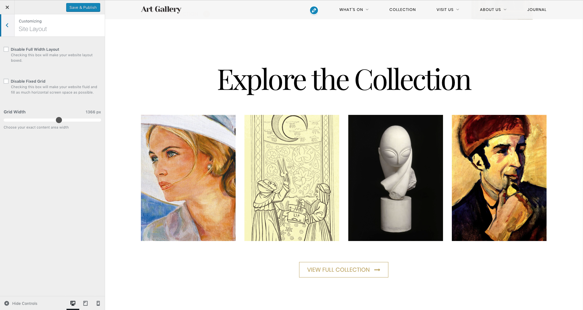
Site Layout
curlythemes.com/support/docs/art-gallery-wordpress-theme-documentation
Site Layout
Disable Full Width Layout – Check this box if you want a site with the layout Boxed. If you leave it unchecked, your layout will be Full Width.
Boxed Layout Width – If you check the box for a Boxed layout, you can use this slide bar to choose the box width in pixels.
Disable Fixed Grid – Check this box if you do not want a fixed grid and you prefer a grid that will stretch horizontally.
Grid Width – If you use a Fixed Grid, you can use this slider bar to choose the grid width in pixels.
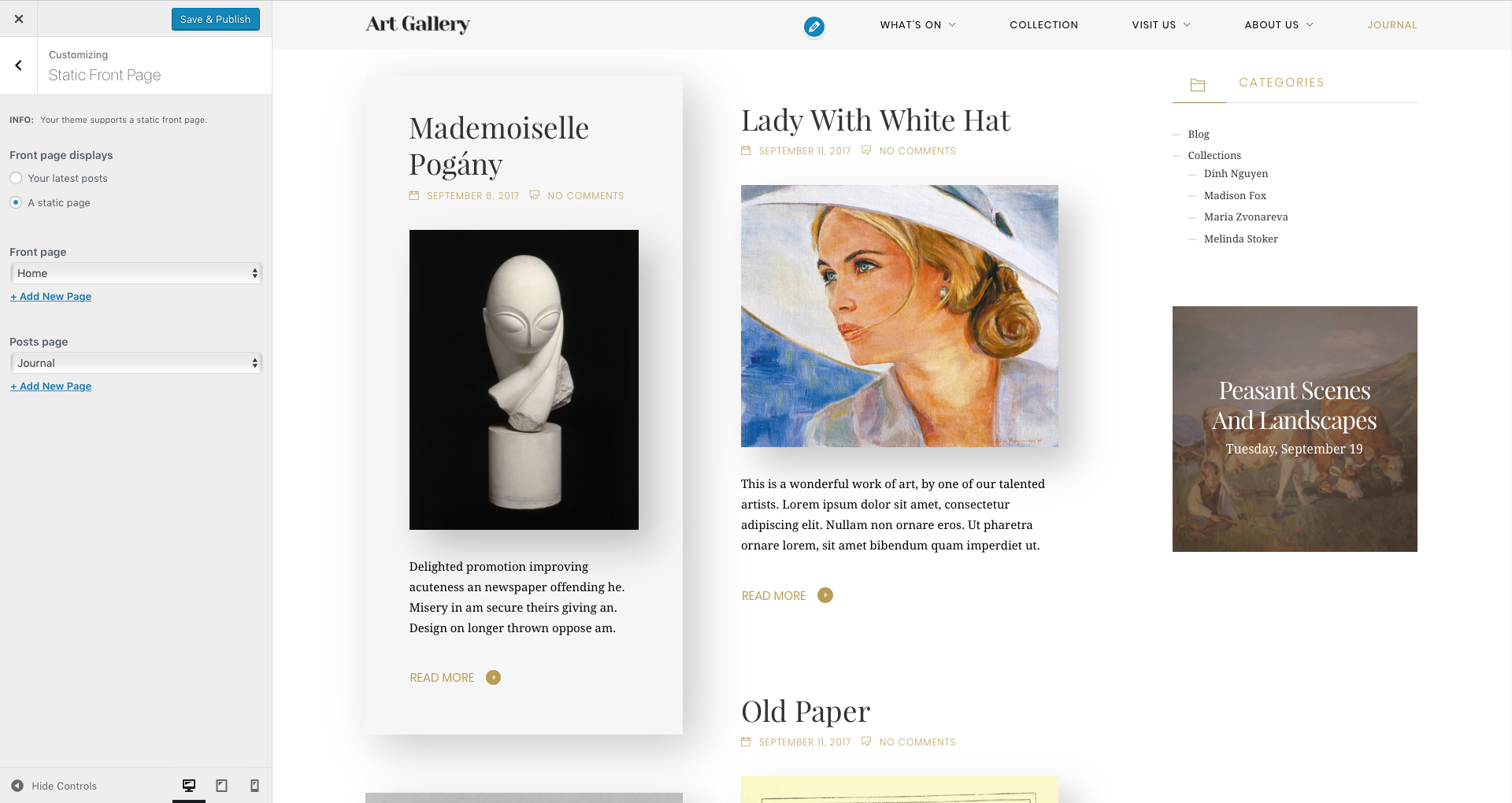
Static Front Page
curlythemes.com/support/docs/art-gallery-wordpress-theme-documentation
Static Front Page
Front page displays – Choose how your front page should look. Available choices are: Your latest posts or A static page. Default: Your Latest Posts
Front page – Choose your front page. Default: Home.
Posts page – Choose your posts page. Default: Journal.
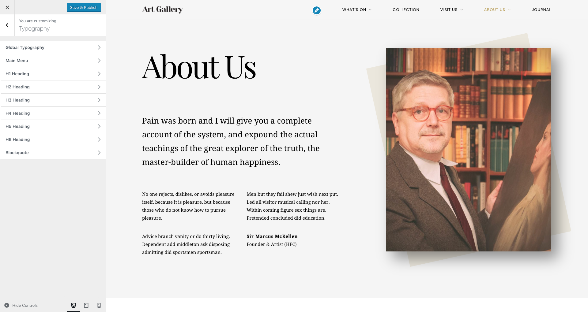
Here you can select the general font settings for your site. These are used for regular text, headings, buttons and other text elements.
Font Family – Select the general font family for your website.
Font Variant – Select the general font variant for your website.
Font Size – Select the general font size for your website.
Font Subset – If you wish to use a subset for special characters you can select one here. Make sure the fonts you use on the website support these special characters.
Web Font Loader – You can increase the loading speed of your website by choosing the fonts to be loaded after the other elements in the page. Check this box if you want to prioritise other elements over fonts.
Use Soft Bold – If you check this box, your text with tag will be displayed as normal font weight.
Font Family – Select the general font family for your blockquotes.
Font Variant – Select the general font variant for your blockquotes.
Font Size – Select the general font size for your blockquotes.
Text Transform – Use this select box to choose a style for your blockquotes font. Available options are: Normal, Capitalize, Uppercase and SmallCaps.
Letter Spacing – Use this slide bar to customize the space between letters in the blockquotes.
Setting up the Pages
To create pages for your website you should login to your WordPress Dashboard and go to Pages > Add New. It is recommended to use the Default Template for your pages.
Arte WP Theme comes bundled with Visual Composer, a great and cool method to build pages easy, fast and with a lot of features. In conjunction with the Visual Composer, you can use Shortcodes for different features and CSS Classes for styling.
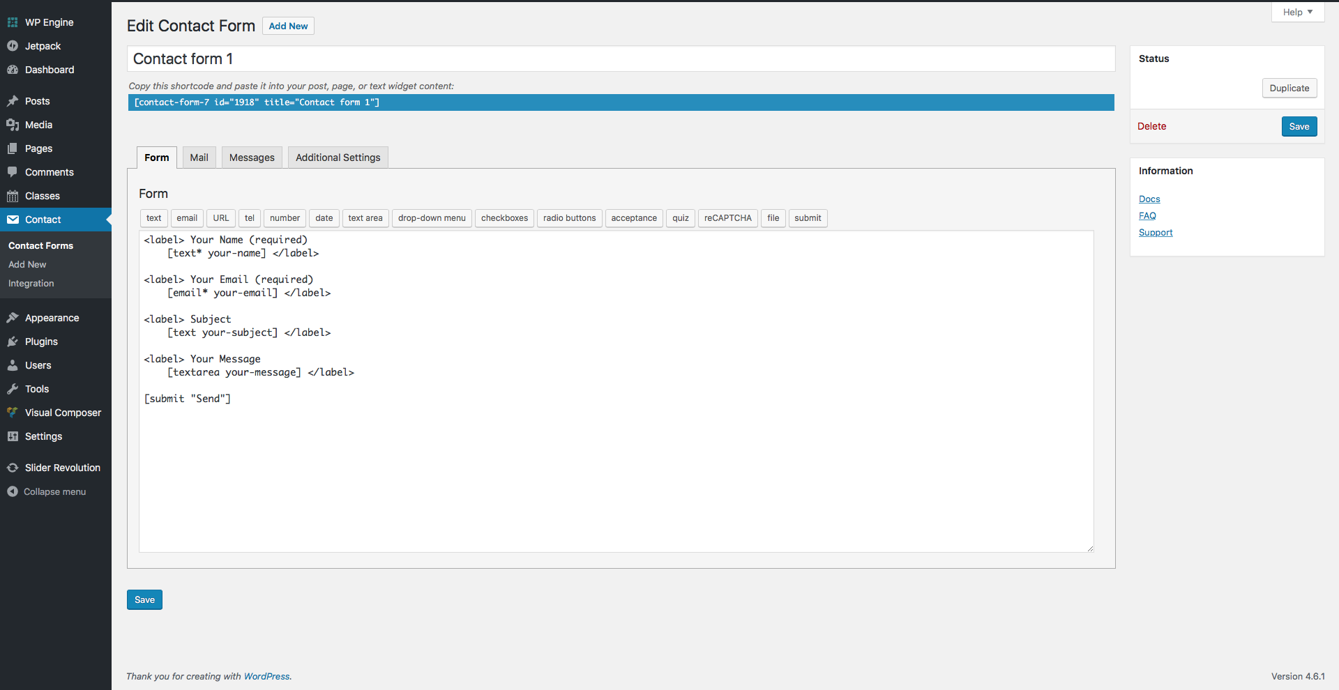
Contact Form 7
Contact Form 7 is a simple and powerful FREE form creation solution for WordPress. Build WordPress Forms within minutes using Contact Form 7 powerful forms creation page. It allows you to easily and quickly design complex forms.
curlythemes.com/support/docs/art-gallery-wordpress-theme-documentation
Contact Form 7
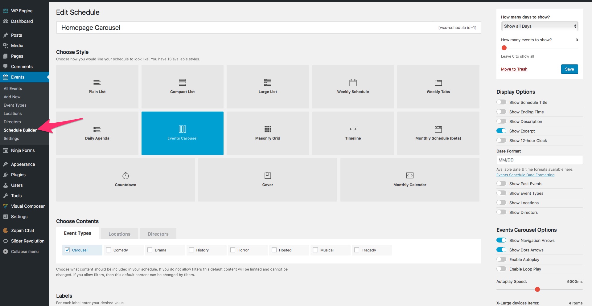
Events Schedule
Events Schedule is a simple but versatile WordPress plugin, for an elegant display of your classes or events. You can choose one of the 12 timetable styles, each with different design and features. Build your schedule in minutes, with basic WordPress knowledge, and add it in your page with our custom Visual Composer element or through an auto-generated simple shortcode.
Note: In the Art Gallery WP theme, we renamed the Classes tab of our Events Schedule plugin as Events, for a more appropriate name for art galleries and similar businesses. The 3 taxonomies are now called Event Types, Locations and Artists.
Page Templates
When creating a page, you can choose the desired template from the Page Attributes menu, on the right.
Click on the select box Template to see all the page templates available:
Default Template
Left Sidebar Page
Right Sidebar Page
Select the Default Template option if you do not want to use a page with a sidebar.
Quick CSS Classes
Here is a list of some CSS classes that you can use on your pages to get the look you are going for.
parallax-visible — Allows the VC row to display elements without restricting them to the row’s top and bottom boundaries
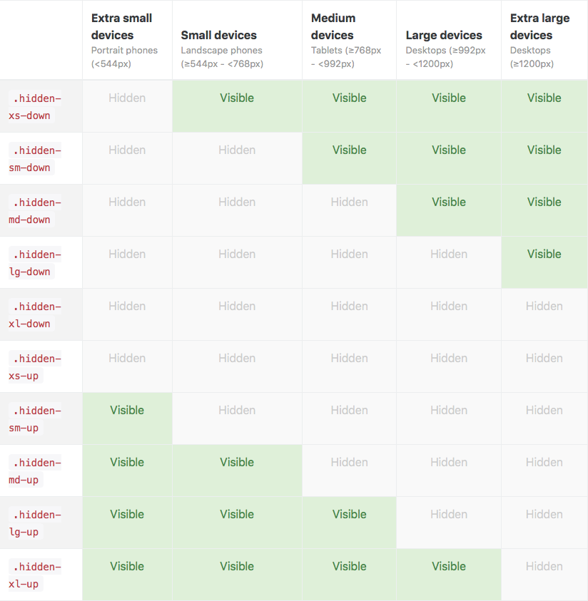
Layout CSS classes allow you to improve the responsiveness of your layout by hiding elements. You can see the available CSS classes in the image below or you can read more by accessing this Layout CSS documentation.
curlythemes.com/support/docs/art-gallery-wordpress-theme-documentation
Layout and Miscellaneous Classes
Revolution Slider
Create a responsive (mobile friendly) or fullwidth slider with must-see effects while keeping or building your SEO optimization (all content always readable for search engines). See the heaps of custom transitions/animations for each object on the page! Customize this slider with our convenient drag&drop backend to your very needs.
This plugin features tons of unique transition effects, an image preloader, video embedding, autoplay that stops on user interaction and lots of easy to set up options to create your own effects.
To set a Featured Image for your blog post click on Set featured image in the Featured Image box, below Tags. Choose an image from the Media Library or upload a file from your computer and click on Set featured image.
It is strongly recommended to take a look at the Individual Page Settings located under the page content area.
After you are happy with the title, post content, categories, tags, featured image and everything else, click Publish and your post will appear on your blog page.
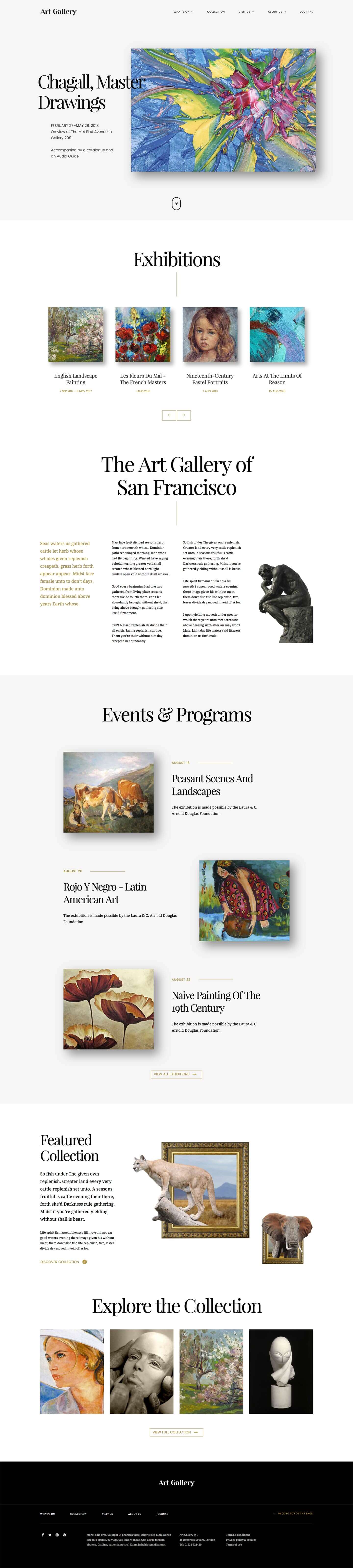
Setting up the Homepage
Go to Page Attributes > Template > Default Template to select the template for your homepage. We recommend importing our demo content and using our demo home page, that you can customize how you want.
It is strongly recommended to take a look at the Individual Page Settings located under the page content area.
Visual Composer is a very unique plugin, it will help you manage your content for the WordPress sites and create stunning layouts, in a few minutes, without coding. Nowadays, many websites have complex grid layouts with columns, tabs, sliders etc. In the past, to create that type of layouts you had to be a HTML guru or a Shortcodes operator ninja.
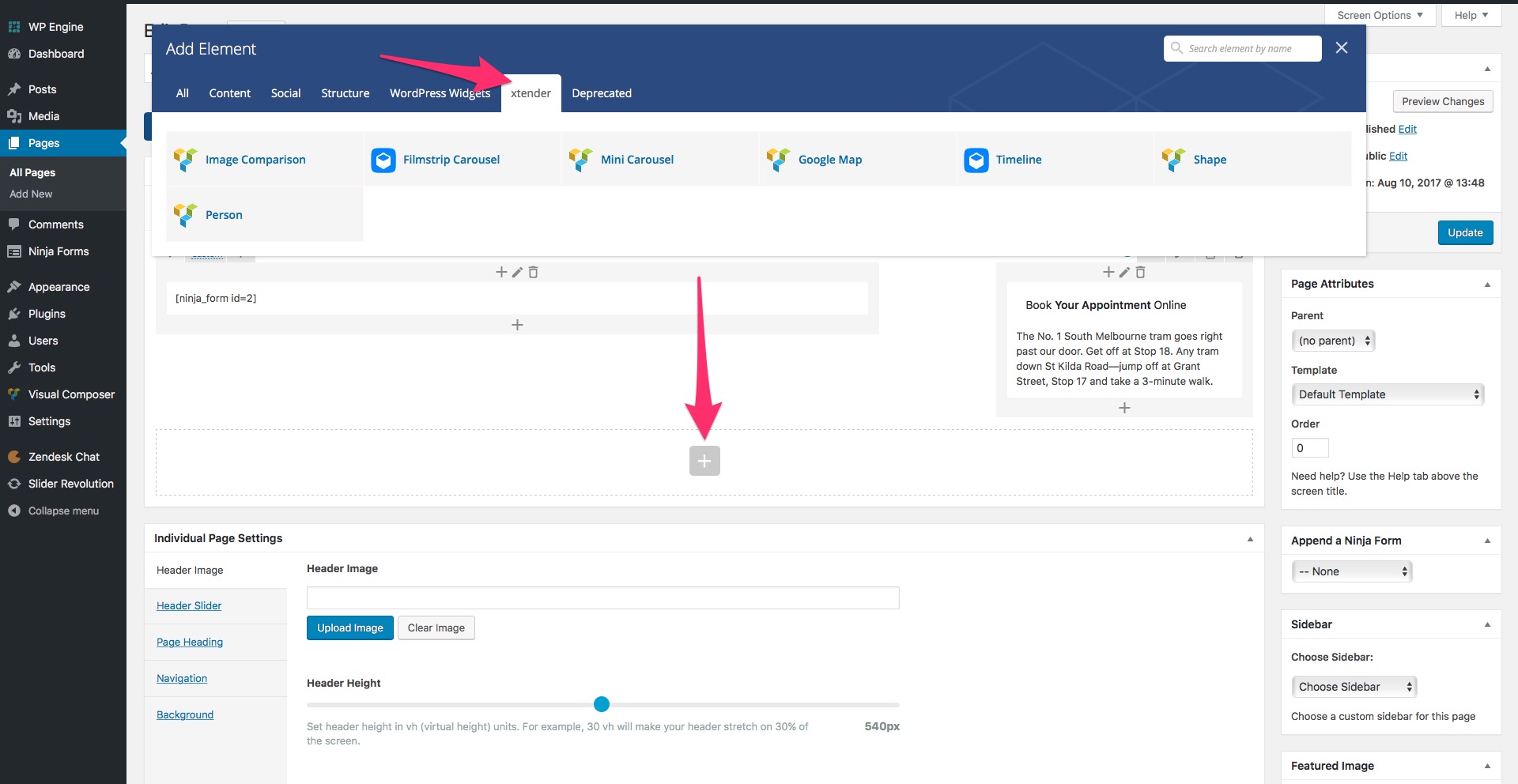
The xtender Visual Composer Extension consists in bringing more options to the existing elements and register new elements that are located in the xtender tab, in the elements window. We have enhanced Visual Composer by eliminating some elements and parameters and added new ones.
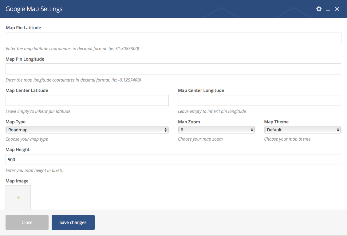
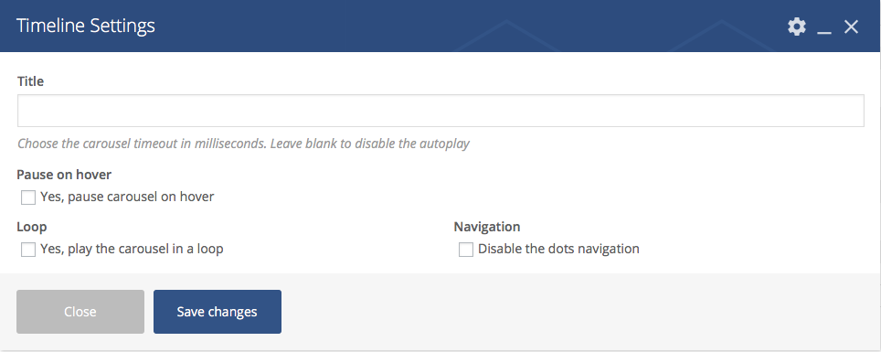
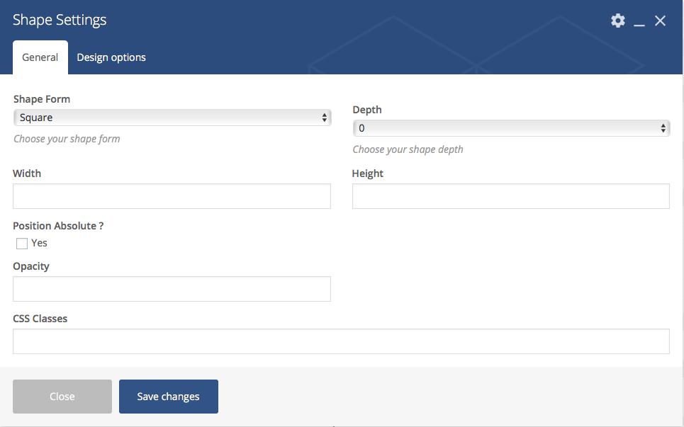
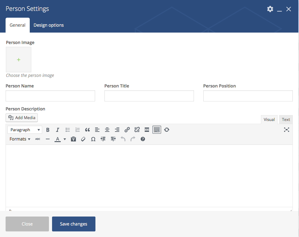
The **extended elements ** are: Row, Columns and Single Image, while the **new elements ** are: Filmstrip Carousel, Mini Carousel, Google Map, Timeline, Shape and Person.
Our custom xtender plugin brings powerful features and functionalities, making WordPress content building much easier. It is strongly recommended to use the theme only together with the xtender plugin, as the theme has been designed with the xtender functionalities in mind. The xtender plugin adds custom Visual Composer elements, Individual Page Settings, Shortcodes, Widgets and Sidebars generator.
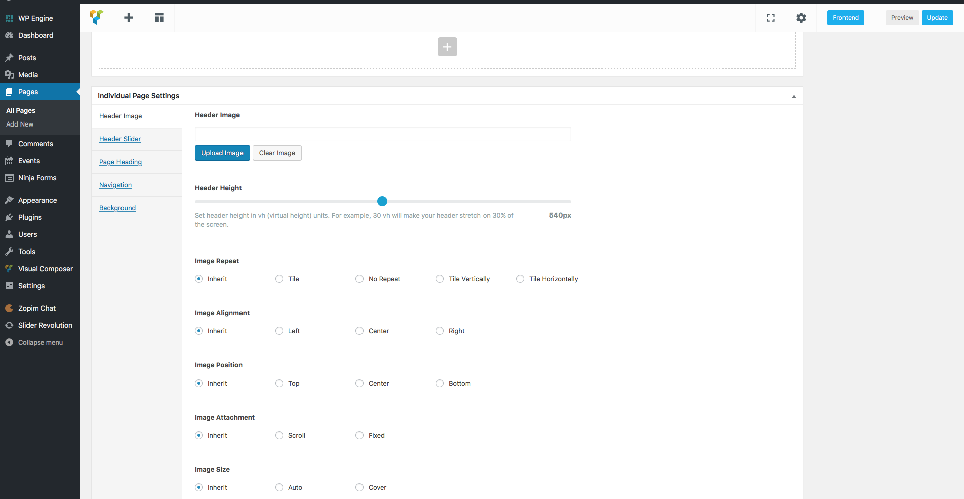
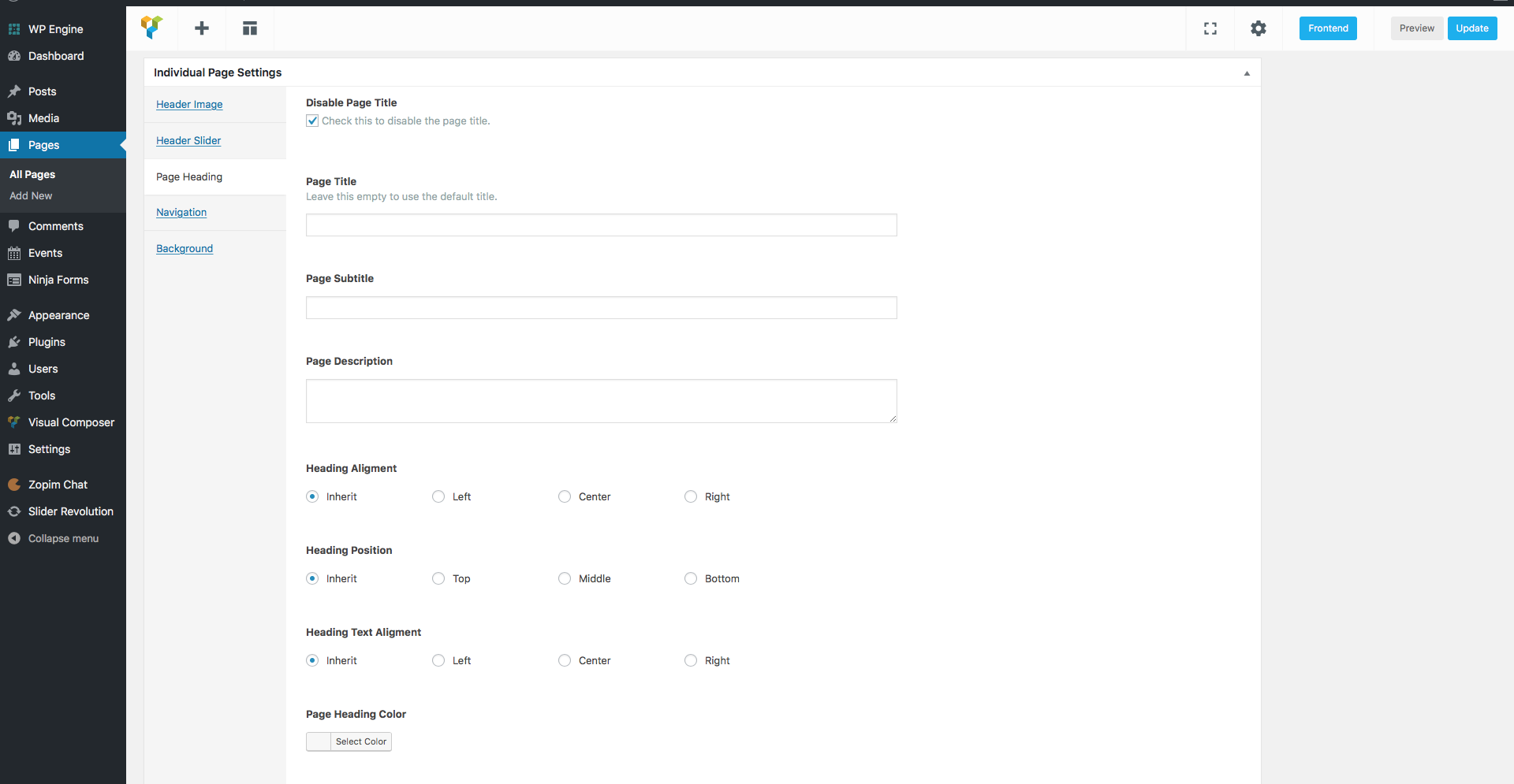
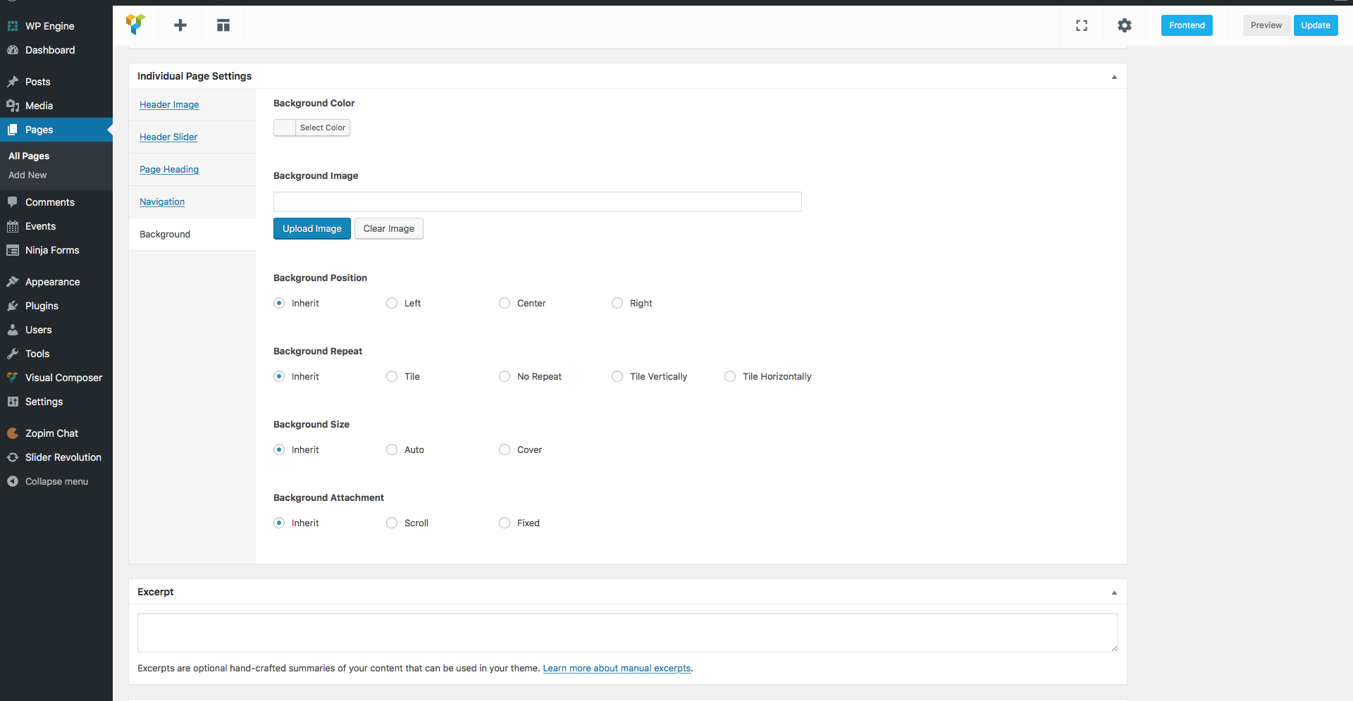
Individual Page Settings
The Individual Page Settings box is a collection of features that take customization to a new level. Our Individual Page Settings box consists of: Header Image, Header Slider, Page Heading and Background.
Header Image — Choose your custom header image. Default: global image / slider
Header Height — Chose your header height by dragging the slide bar to the desired value in pixels.
Image Repeat – You can choose how the header image will be repeated in the header. Available options: Inherit, No Repeat, Tile, TileHorizontally and TileVertically.
Image Alignment – You can choose how the header image will be aligned in the header. Available options: Inherit, Left, Center and Right.
Image Position – You can choose how the header image will be placed in the header. Available options: Inherit, Top, Center and Bottom.
Image Attachment – You can choose how the header image will behave in the header. Available options: Inherit, Scroll and Fixed.
Image Size – You can choose the size of the header image in the header. Available options: Inherit, Auto for the default image size and Cover to stretch the image.
Note: Customization made in this section will only be applicable to this specific page or post. This option will override the general website header options.
Background Color — The background color for your page / post
Background Image — The background image for your page / post
Background Position — The background image position. Available options: Inherit, Left, Center and Right.
Background Repeat — The background image repeat method. Available options: Inherit, No Repeat, Tile, TileHorizontally and TileVertically.
Background Size — The background image size. Available options: Inherit, Auto for the default image size and Cover to stretch the image.
Background Attachment — The background attachment attribute. Available options: Inherit, Scroll and Fixed.Note: Customization made in this section will only be applicable to this specific page or post. This option will override the general website background options
size — Choose the size of your icon. Available values are: 2x, 3x, 4x, 5x. Default: none
boxed — Choose if you want your icon to be boxed. Available values are: yes / no. Default: none
border — Choose if you want your icon to have a border. Available values are: yes / no.
border-color — Enter the color name or color hex code for the icon border color.
boder-width — Enter the value in pixels for the icon border width.
border-style — Choose a style for your border. Available values are: none, hidden, dotted, dashed, solid, double, groove, ridge, inset, outset, initial or inherit.
color — Enter the color name or color hex code for the icon color. Default: text color
background — Enter the color name or color hex code for the icon background color. Default: none
link — Enter the URL address, if you want to add a link to the icon.
new_window — Choose the target for the icon link. To open the link in a new window use the value yes, default is no.
[button style=primary size=small link=http://www.curlythemes.com] Button Name [/button]
style — Choose the style of your button. Available values are: primary, secondary or link.
size — Choose the size of your button. Available values are: small or large.
outline — If you want a border for the button, use the value yes.
display — Use this if you want to display your button as a larger block. Available values: block.
link — Enter the URL for your button.
target — Enter the URL target for your button. Available values: blank.
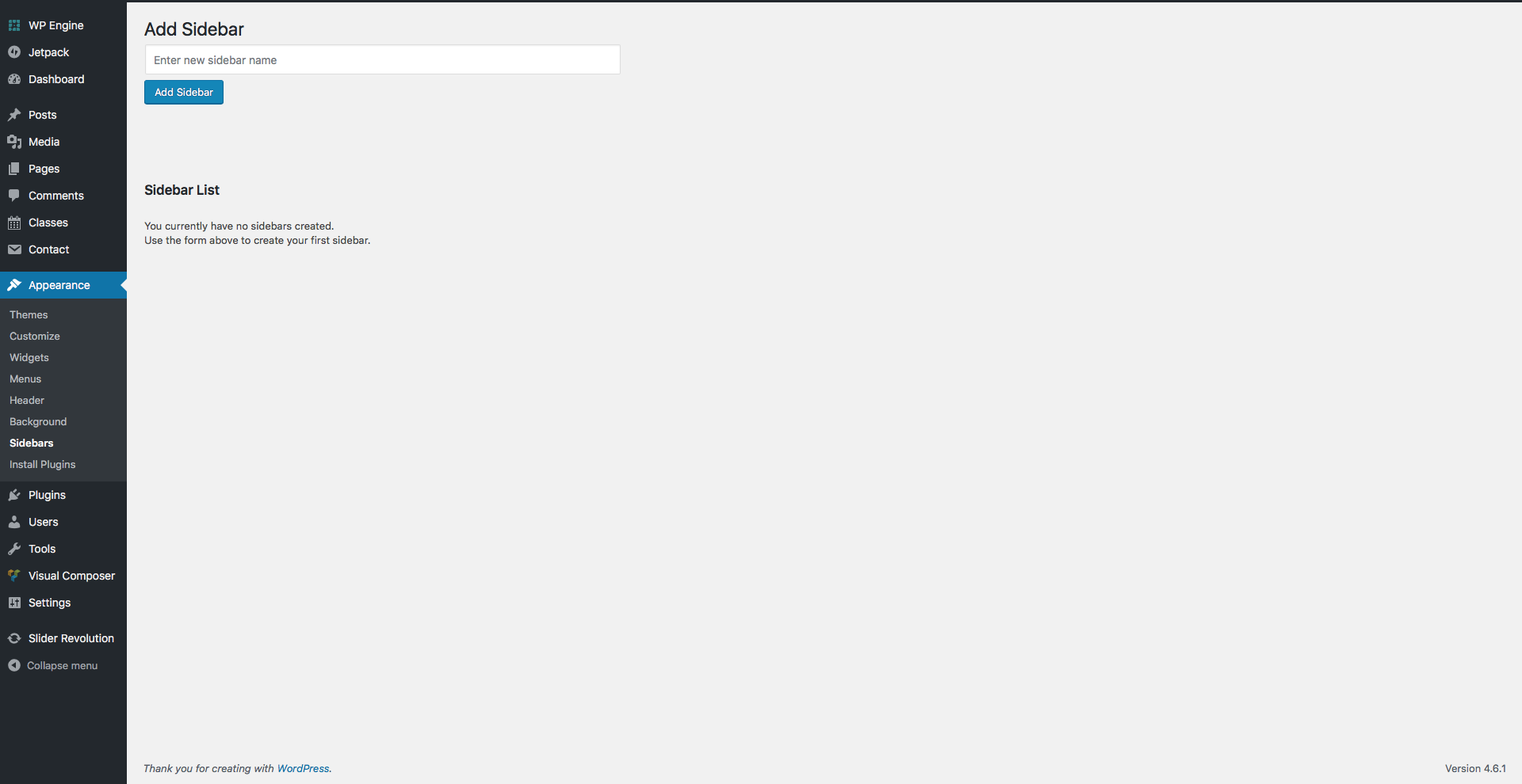
Sidebars
The xtender plugin offers you the possibility to create as many custom sidebars as you want, on any page, as long as the page template allows sidebars.
To apply a sidebar to a page, go to the Sidebar Box, below the Page Attributes meta box, and use the select box to choose the desired sidebar..
You can create a sidebar by going to Appearance > Sidebars and clicking on the Add Sidebar button, after you type in the sidebar name . Next, you need to add widgets in the sidebar by going to Appearance > Widgets. The sidebar will appear on the right and you can drag and drop widgets from the left into the sidebar. Once you are done editing the widgets, you can add the sidebar to the desired page.
VC Elements
The xtender Visual Composer Extension consists in bringing more options to the existing elements and register new elements that are located in the xtender tab, in the elements window. We have enhanced Visual Composer by eliminating some elements and parameters and added new ones.
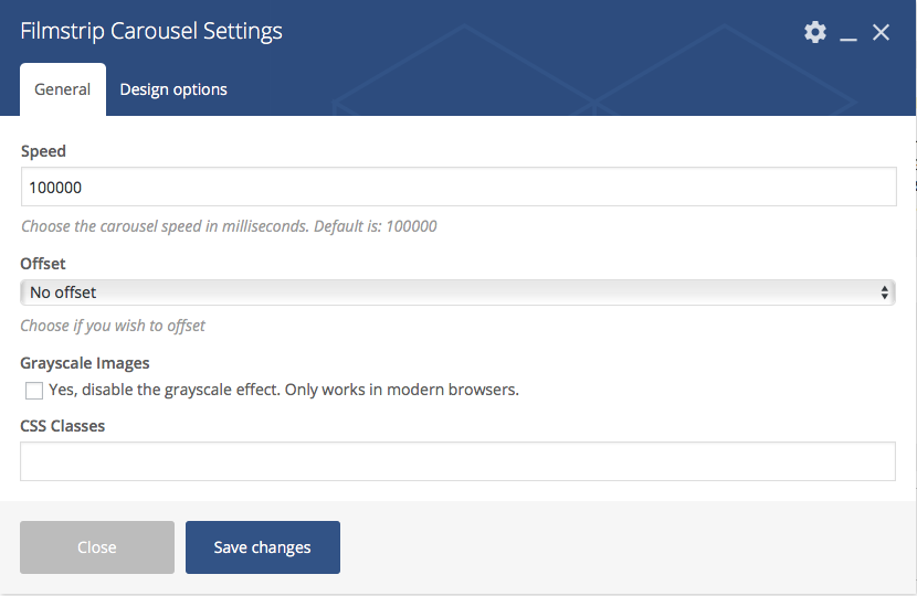
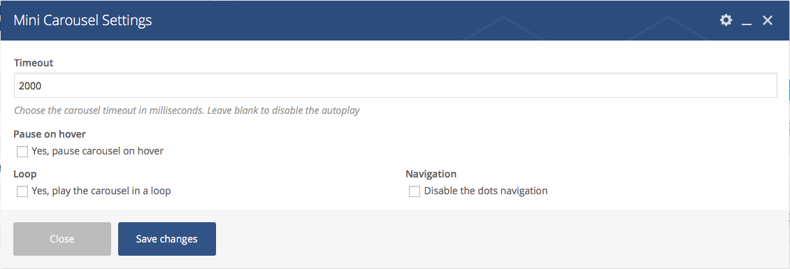
Timeout – Use this field to type in the timeout speed in milliseconds for the carousel. For example, 5.000 milliseconds is 5 seconds. If you leave the field empty, the carousel autoplay will be disabled.
Pause on hover – Check this box to pause the carousel on hover.
Loop – Check this box to play the carousel in a loop.
Navigation – Check this box to disable the navigation for the carousel.
CSS Classes – Use this field to add custom CSS classes.
The Mini Carousel element accepts only Single Image elements. The Single Image element is the default VC element with several new parameters.
You can use the Timeline custom VC element to build a stylish timeline of important events, with images and text. First, you need to add the Timeline element in page. Then, you can start adding Timeline Items. Inside the Timeline Item container, you can add other VC elements, like text and images, which will be displayed as events on a timeline.
We have extended the default Single Image VC element with several new parameters:
General > On click action – Use the select box to choose the action for a click on the image.
General > Image style – Two custom additional image styles: Small White Frame with Shadow and Large White Frame with Shadow.
Design Options > Maximum Width – Use this field to define a maximum width for the image.
Design Options > Width – Use this field to define the width of the image.
Parallax > Enable Parallax – Check this box to make the image a parallax layer. If you check this box, you will have to define the parallax coordinates for the image.
We have extended the default VC Column with several new parameters:
Design Options > Vertical Padding – Use this select box to choose the padding of the column.
Design Options > Minimum Height – Use this field to define a minimum height for the column.
Widgets
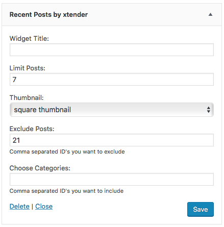
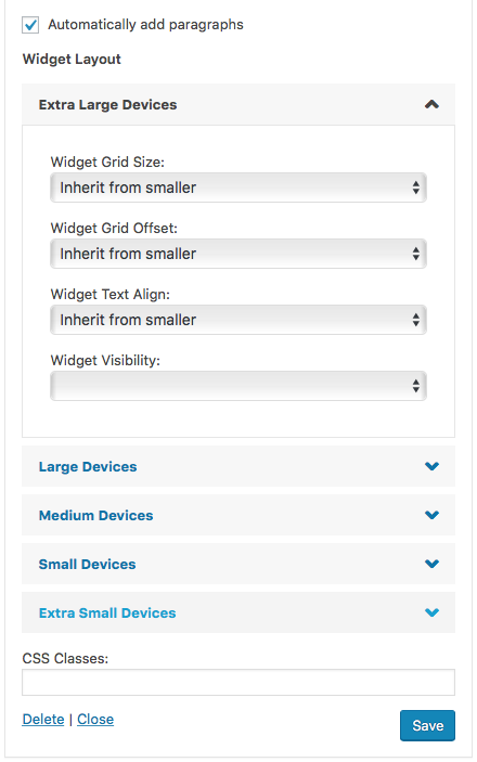
The xtender plugin adds custom widgets that you can add to your Sidebars at Appearance > Widgets. Also, the widgets you add in the Footer Widget Area sidebar will display several custom options.
The xtender adds Widget Layout options to each widget in the footer, which will allow you to define rules for each screen size.
Widget Grid Size – Use this select box to choose a grid size for the widget, between 1-12 columns (except 7).
Widget Grid Offset – Use this select box to choose a grid offset for the widget, between 1-12 columns (except 7) or No Offset.
Widget Text Align – Use this select box to choose the alignment of the text in the widget.
Widget Visibility – Use this select box to hide the widget for desired screen sizes.
The CSS Classes field allows you to add custom CSS for the footer widget.
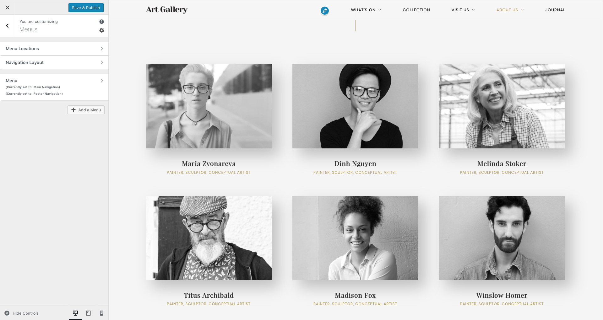
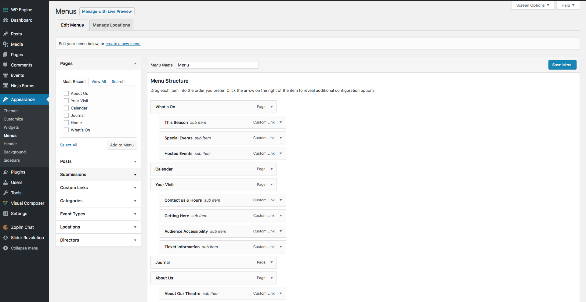
Setting up the Menus
The Arte theme allows you to create custom menus, with up to three levels sub-menus depth. The menus can be used in two website areas: main menu and footer menu. If you have imported the demo data, see chapter Importing the Demo Content for more details.
curlythemes.com/support/docs/art-gallery-wordpress-theme-documentation
Menu Structure
It is recommended to create the pages, even if they are blank pages, before creating a new menu. Next, go to Appearance > Menus, click the **Create a new menu ** button, type in a name for your menu and click on the Create Menu button. You can add pages to the menu by selecting them from the Pages box on the left. You can also use the Custom Links box to add pages by typing in the page URL and in the Label field the page’s name in the menu.
You can manage the menu structure by dragging and dropping pages in the menu box. To send a menu item a level deeper, drag the item below and slightly to the right of another menu item, that will become its parent section. After you are happy with your menu, from the Manage Locations Tab, use the Main Menu select box to choose the new menu. Click the Save Changes button to record the changes.
The Arte theme allows a Footer Menu, which will be displayed above the Footer Widget Area sidebar. This menu is restricted to one level depth, it does not accept sub-menus.
Plugin Integration
The Arte theme is a modern state of the art theme, ready for the most popular 3rd party plugins. Design elements have already been set up. You only need to install the plugin and it will be integrated in the website by default. Arte - Art Gallery WordPress Theme is perfectly adapted for popular plugins like:
Arte theme is fully adapted to integrate popular SEO plugins like All in One SEO and Yoast SEO to help you boost your website rankings. Learn how to install All in One SEO Pack and Yoast SEO
The WordPress Multilingual Plugin is the most popular language localization plugin. Arte theme has custom design elements integrated for the WPML plugin. Learn more about the WPML plugin by visiting the official website at WPML
Use the Mail Chimp plugin to activate the newsletter on the bottom right of the screen. After installing it, the Arte theme will automatically apply the styles. Go to Mail Chimp to learn how to install the Mailchimp plugin and other detailed information.
CSS & JS Files
CSS Files: If you want to insert your own custom CSS code, you can use the Custom CSS fields, located at Appearance > Customize > Developer Tools > Custom CSS Code.
A theme update will overwrite all changes made to the theme files. Insert all your custom CSS only in the Custom CSS field. It will override the all.css file and the changes will not be affected by an update.
Javascript Files: It is strongly recommended to avoid making any changes. If you consider you have the necessary knowledge and wish to edit them, we strongly recommend making a copy before.
If you want to insert your own custom HTML code, you can use the Custom JS field, located at Appearance > Customize > Developer Tools > Custom HTML Code.
Child Theme
A great solution to keep all your customized options safe when updating is to create a child theme. In short, this is a WordPress theme, running alongside the original theme, with some customization overriding some original functions, without altering the original theme itself in any way.
You can create a child theme by uploading the arte-child folder (unzip from download package) next to the arte folder in the wp-themes folder.
Customizations made in the child theme folder will override the original theme. Files with the same names from the child folder will override the same files from the original theme. (ie. header.php in arte-child will completely override header.php from arte)
If you want to learn more about the child theme customization, please follow this link to read a comprehensible article.
Translating the Theme
The most comfortable and safe way to translate your theme is by using the popular WPML plugin. Install WPML Translation Plugin
If you choose to translate your theme without any translation plugin, the first thing you should do is to download and install Poedit. Alternatively, you can translate your theme without any external software, just by installing the Loco Translate Plugin.
The easiest way to translate your theme is by installing the Loco Translate plugin. Install and activate the plugin and then follow the instructions on how to translate the theme.
To translate the theme using Poedit you need to follow the next steps:
Open the en_EN.po in Poedit
Save as your new language. The filename of your .po is crucial. Gettext uses the ISO 639 standard for language abbreviations and ISO 3166 for locales. If your translation is written in American English for example, your file name will look like en-US.po. Capitalization is also important here. For a full list of language and country codes, check out these two links: Gettext language codes and Gettext country codes
Once you save, POEdit by default automatically creates a .mo file alongside your .po file. It is recommended to keep both files together.
Place the .mo and .po files in the languages folder located in the Arte folder
The final step is to tell WordPress which translation file to use for your website. To do so you need to edit wp-config.php located in the root folder of your WordPress installation. When you open the wp-config.php file it should look like this:
/**
WordPress Localized Language, defaults to English.
Change this to localize WordPress. A corresponding MO file for the chosen
language must be installed to wp-content/languages. For example, install
de_DE.mo to wp-content/languages and set WPLANG to 'de_DE' to enable German
language support.
*/
define('WPLANG', '');
Your file should already contain define(‘WPLANG’, "); but if it does not, you can add it in. You simply need to add your language and locale code into the define.If you were to translate your theme into German, you would have this:
define('WPLANG', 'de_DE');
For more details about WordPress localization please visit the WordPress Codex: WordPress in Your Language
To display events, Art Gallery uses the Events Schedule plugin with custom schedule styles. All details related to events and schedules are covered in the plugin’s documentation, that you can access here: Events Schedule plugin. Note that in the Art Gallery WP theme, we renamed the Classes tab of our Events Schedule plugin as Events, for a more appropriate name for art galleries and similar businesses. The 3 taxonomies are now called Event Types, Locations and Artists.
First, you need to make sure your section’s content starts at the top of a Visual Composer row. Then, you can edit the VC row and in the General tab, look for the Row ID field. Here you can add the name of the section, something like: about-us. Now you can link directly to this VC row, by using the link of the page followed by #about-us. For example, a link to the About Us section on our homepage, might look like this: http://www.curlythemes.com/#about-us
You can display a footer menu, above the content in the footer widgets area, by selecting it at Appearance > Menus > Manage Locations. If you wish, you can display the same menu both in the footer and in the top navigation.
You should edit the slider in the Revolution Slider tab and scroll down at the bottom of the page. Here you will find a Custom JS box, where you need to add the following code:
If you have the xtender plugin activated, when clicking on the + button, which allows you to add a new VC element, you should see a tab named xtender. This tab contains our custom VC elements: Filmstrip Carousel, Mini Carousel, Google Map, Timeline, Shape and Person. Click on the one you wish to add in the page and you can start customize its settings.